Index
tl;dr
Another post for my own benefit, having written whilst falling down a rabbit hole about brand colours and colour scales and ramps.
busywork
Leave the busywork to AI.
Building and iterating on colour ramp for a design system seems to be a very long winded and tedious process.
craft
There is a wealth of information on the internet and I do not pretend to be an expert on the mechanics of creating colour primitives for a brand, so this involves a bit of learning. Still I am not sure things have moved on that much since Werner’s Nomenclature of Colours (1814). Scottish painter of flowers Patrick Syme’s adaptation of German geologist Abraham Gottlob Werner work to create a standard of names for the colours of minerals.
bkg

How did I end up at my current blogs brand colours? I originally had a freelance company and it was called CharlieMYK. So the site had a Cyan and Magenta colour scheme. It has persisted through subsequent iterations.
Inspiration
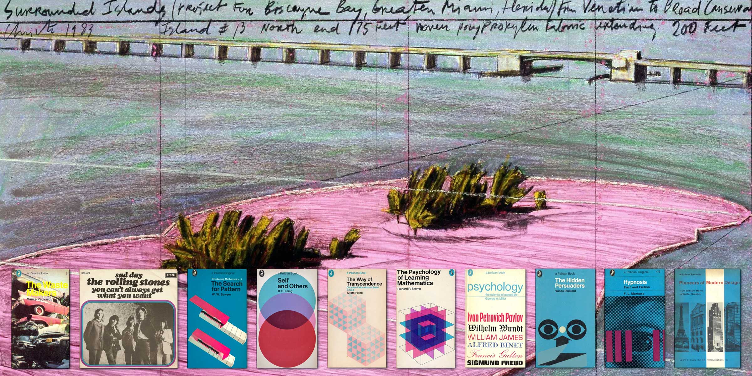
I started with the CM out of CMYK and from Christo’s surrounded islands to Penguins book covers I think its an elegant pairing.
Problem?
Take my existing and established set of colours, and see if they can be expanded into a full set of colour scales, to test and compare various ways of generating the scales.
Learning by doing
I started by wanting to understand the best practises on creating a design system, and all of them seem to start off with the creation of colour scales.
Colour tokens and variables set up.
First Manual Attempt
The tutorial videos all seem to work towards and extraordinary amount of abstraction, layering and inheritance of information in order to give designers the ability to control and adjust their variables. It would seen a long way for information to cascade.
Design System & Figma Variable Set Up – Full tutorial
The UI collective tutorial talks about three levels of information for your design system.
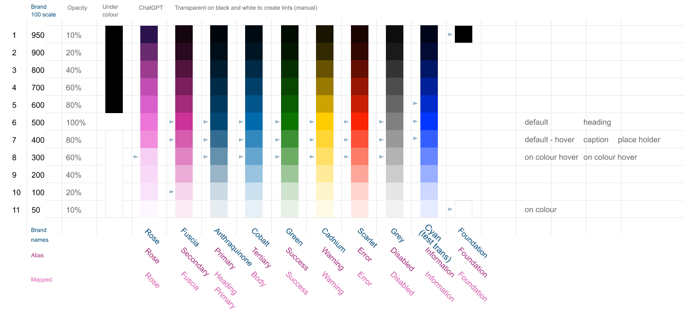
Brand which just captures the basics, colours, fonts, and a scale. The connvention is that the colours get described in increments of 100 which actually reflect taking a starting strong colour and working through 20% transparent increments against a white and black background.
In order to lend some meaning to these raw colours, they are given Aliases so greens can become your ‘success’ colour. Aliases describe what the colours re-used for. In my case a deep blue which I am calling Anthraquinone becomes my core ‘primary color’. My secondary is a pink I am calling ‘fuschia’.
Then the aliases are Mapped to what they will actually be used for. So for example my headers will be in the primary dark blue, so the collection Mapped contains a variable text/default/heading which is named ‘heading’ and assigned the string value ‘Primary/500’. This is the ‘alais’ value which identifies the role of the ‘Brand 500’ as a ‘primary’ colour. In turn the Brand 500 is a numerical value which defines itself as #004774.
This creates a three sets of variables, which the UI collective recommends gives the greatest level of flexibility and consistency at the same time.
Issues
I wasn’t very happy with using transparencies over black as it created murkey grey colours with the yellow and at the top of the scale everything became black. Also this seemed to involve starting with the 500 value in the middle of the range.
One of my brand colours a pale pink that was clearly a lighter pastel pink so would be at the three hundred level of the scale. I couldn’t work out how to manually adjust to move up to 500 value in photoshop.
AI
In the end I fed the original blue scale into ChatGPT and asked it to calculate an equivalent pink scale and I think it did an OK job. But it is a bit black box I couldn’t see how it calculated the steps. The colours did however avoid the murkey grey issue.
Colour tokens and variables set up.
Second Manual Attempt but with more plug in automation
How I Build a Tailwind-Ready Color System in Figma (From Scratch)
Designer Up, presented by Elizabeth Alli, talks a bit more about the mechanics of integrating with a coding system like Tailwind, but she is also an advocate for using plug ins and apps to automate the creation of the colour scales and steps.
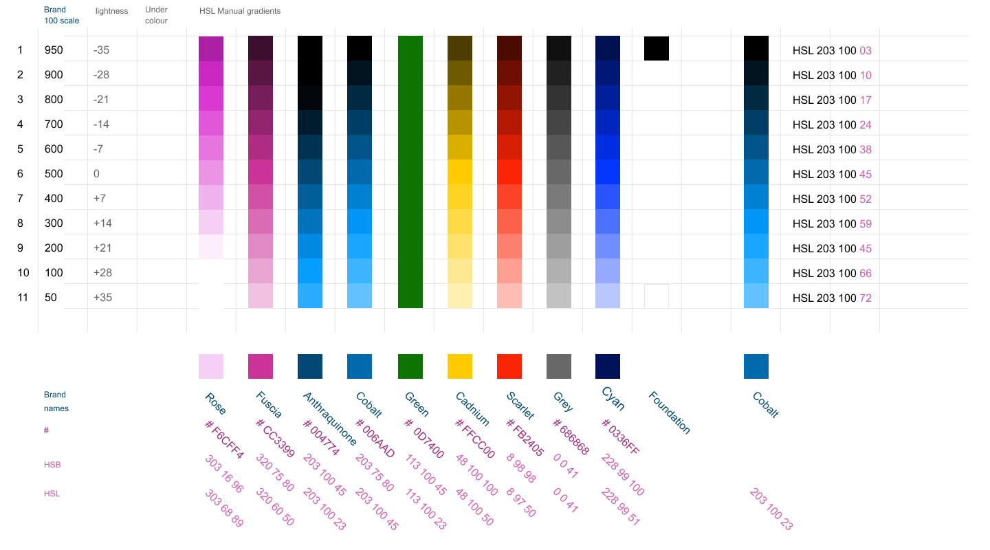
She does have a great explanation of how to manually create the steps in the scale without the usage of transparency over black and white.
As someone used to working in the Hex, RGB and CMYK space the use of HSL to generate scales when Elizabeth does it manually was a good peak into what is part of the black box of colour generation.
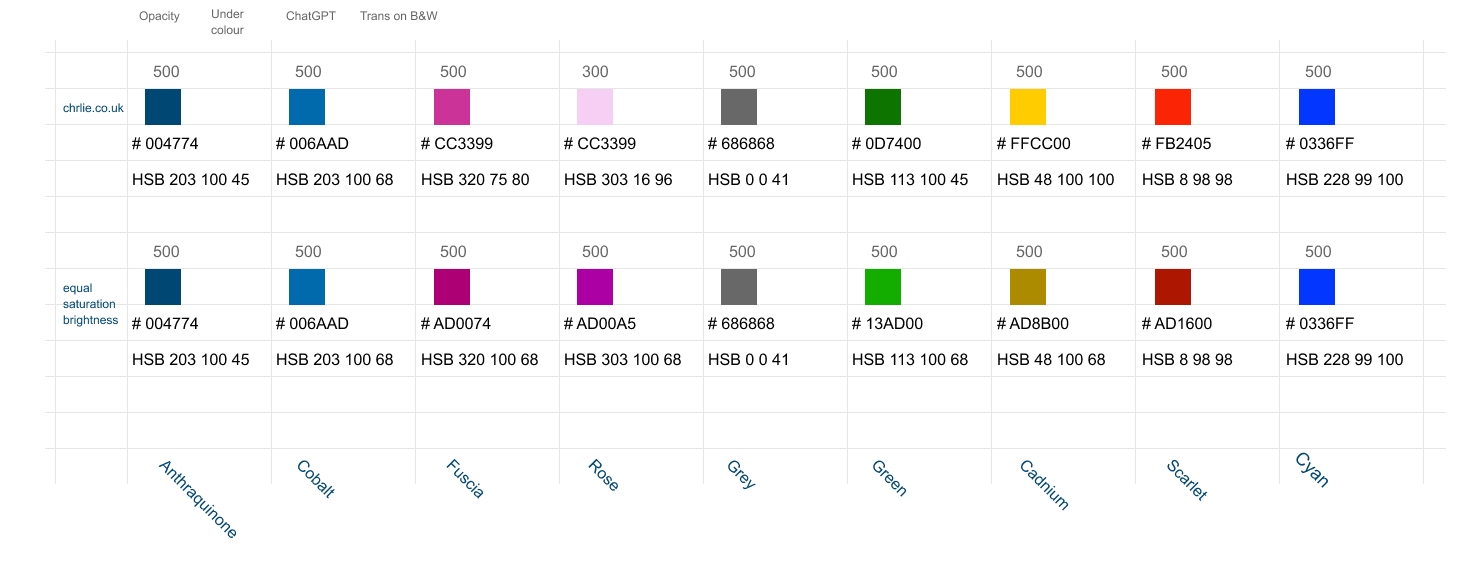
In the first case she recommends starting with a consistent range of colours, which she achieves by using an HSL palette and just shifting the hue. My existing framework doesn’t quite match that model. Although it did reveal that my Cobalt should really be my primary and that my Anthraquinone is actually a scale value within it.
She also recommends a few plug ins and web apps. I was very taken with UI colours, a ‘Tailwind CSS Color Generator. Instantly create stunning color scales by entering a base color or hitting the spacebar.’
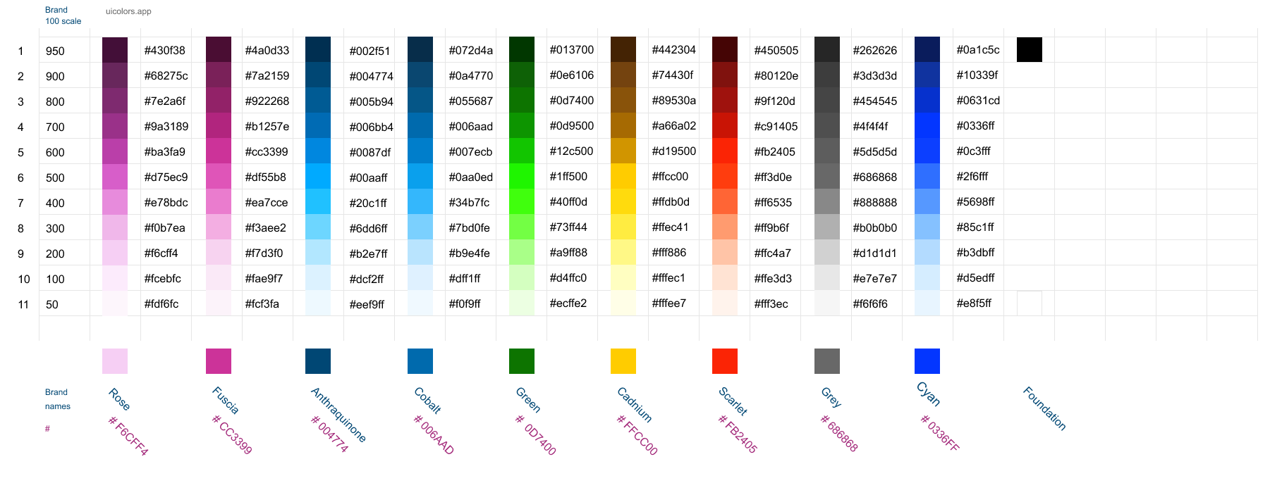
She uses it to create a tailwind comptable set of colour ‘ramps’ scales. Tailwind in turn have adopted material designs jumps of 100 for naming convention. The idea being a hue ‘blue’ is constant whilst changing its lightness.
If you have one hue ‘blue’ and you want colours that correspond you can just alter the hue value to achieve a range of hues all with the same saturation and brightness.
This is a lot easier if you are using an HSL picker. My palette does not start out this way so my base colours do not correspond for saturation and brightness.
Curveball
OKLCH
As part of my research I have come across OKLCH, which is the colour framework that tailwind is using. With OKLCH, you can slide the hue (colour) around and still achieve consistent visual results apparently.
L (Lightness):Controls the perceived brightness of a color, ranging from 0 (black) to 1 (white).
C (Chroma):Represents the intensity or saturation of the color.
H (Hue):Specifies the actual color itself, such as red, green, or blue, measured as an angle on a color wheel.
This has the possibility that if you define your colours in the css at a semantic level that corresponds to my first attempts ‘aliases’ you can end up with a site that has any colour theme that you could want. So the colour of your site becomes dynamic not static? This is a level of code and colour abstraction that I am not too comfortable with, so you probably need to read Evil Martians article. To quote them…
‘This is where OKLCH comes into play. It’s not just another color space; it’s specifically designed for uniform color perception. With OKLCH, you can slide the hue around and achieve consistent visual results—with no more need for any DIY formulas.’
https://evilmartians.com/chronicles/better-dynamic-themes-in-tailwind-with-oklch-color-magic
This is a colour gradient calculator for OKLCH
Issues
Unfortunately I found the OKLCH colour gradient calculators a bit hit and miss. I tried oklch.com and used oklch-palette.vercel.app. So whilst being unfamiliar with OKLCH i may have misunderstood how to manipulate some of the values.
I didn’t get round to using this colour calculator which may turn out to be the more useful. https://www.uihue.com
Comparison
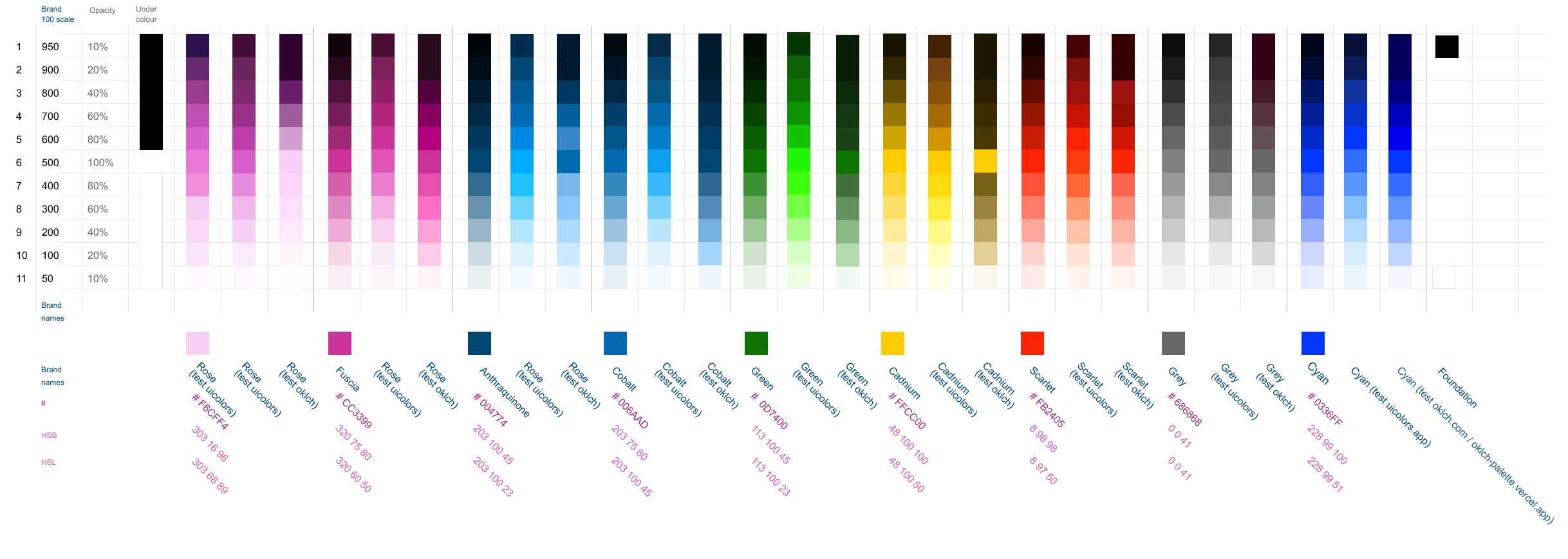
A comparison of all three different ways of generating different types of colour scales and ramps. Some of the online tools were pretty good but it is hard to match a persons individual perception of colour.
I was trying to see if I could avoid the top of the range becoming almost black, but was unable to do so.
Considering how few colours one is actually going to use in most interfaces it does seem as if Galls laws starts to apply. Get just enough colours to work, but if you try and build all the scales perfectly from the get go. Its never going to happen.
“A complex system that works is invariably found to have evolved from a simple system that worked. The inverse proposition also appears to be true: A complex system designed from scratch never works and cannot be made to work. You have to start over, beginning with a working simple system.”
A solution to a possible problem seems to be adding more complexity. Two colours cyan/blue and magenta/pink became a colour scale of 22 tints. To give warning, alert, error, inactive/disabled and information states we added 55 other tints. So instead of helping, we did added more. Then tried to make all 77 tints and shade into an elegant scale. It actually ended up being 99 as I wanted secondary versions of the two primary colours. Feels like its become a complexity doom loop.
Colour tokens and variables set up.
Third attempt using AI LLMs
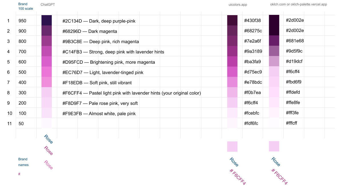
As I mentioned earlier, one of my brand colours was a very pale pink # F6CFF4, this would not be at the middle point of a tailwind scale it would be at the lighter end. I couldn’t see how to easily backwards engineer the scale from a pale starting colour.
I fed an example blue scale into Chat GPT and then asked it create a similar set of swatches for my fuschia/pink colour which it did.
But this highlighted a problem with the existing scale tools.
- If an existing colour is light or dark a lot of the scales start at the 500 mid point giving you a skewed scale.
- Having created a scale you may find the scale doesn’t have the range you want so you may want to move your source ‘anchor’ colour up and down the scale to create a more elegant range
- Some of the tools at the light end and dark end of the range always end up so pale as to be almost white, and at the other end so dark as to be black. This means of 11 colours 4 or 5 aren’t actually useful.
As you will see in my subsequent posts I actually went and built my own tailwind like colour/scale ramp generator using Chat GPT and Figma Make.
What started off as a little experiment with colour as part of a bigger project about creating and managing design systems with a bit of help from AI became a bigger project about building bespoke tools in AI.