So in trying to update this blog/portfolio site I have tried to stay loyal to using WordPress but have found it a slightly frustrating experience, and am worried that WordPress is loosing its magic as a lightweight CMS with easy to use additional plug ins and themes to get you where you want to be. Previously I had used twentythirteen with a child theme so I could introduce some bespoke php layouts. But I thought it needed updating. Maybe it’s a good idea? Dunno. As ever its a work in progress.
This post is me thinking out loud as I try to make sense of updating and fine tuning this very basic blog.
Reality
Who looks at your website?
Nobody does until you start applying for jobs. In the current market they also apparently only look at it for ten seconds and they scan it.
Also there is a massive difference between websites based on the stage of career people are at. So senior people tend to have text heavy ‘I’m a great thinker’ type of sites and middle weight and junior people tend to have , ‘Here’s some stuff I actually built.’
Personally I prefer to be able to show a bit of professional work and as importantly some personal work which actually shows other creative interests and passions.
I have recently shied away from thought pieces as medium has ruined ‘this is what I think about this latest thing’ for me. Really am I that unique a thinker? Do you really care?
There is also an ocean of advice on what makes a good design portfolio.
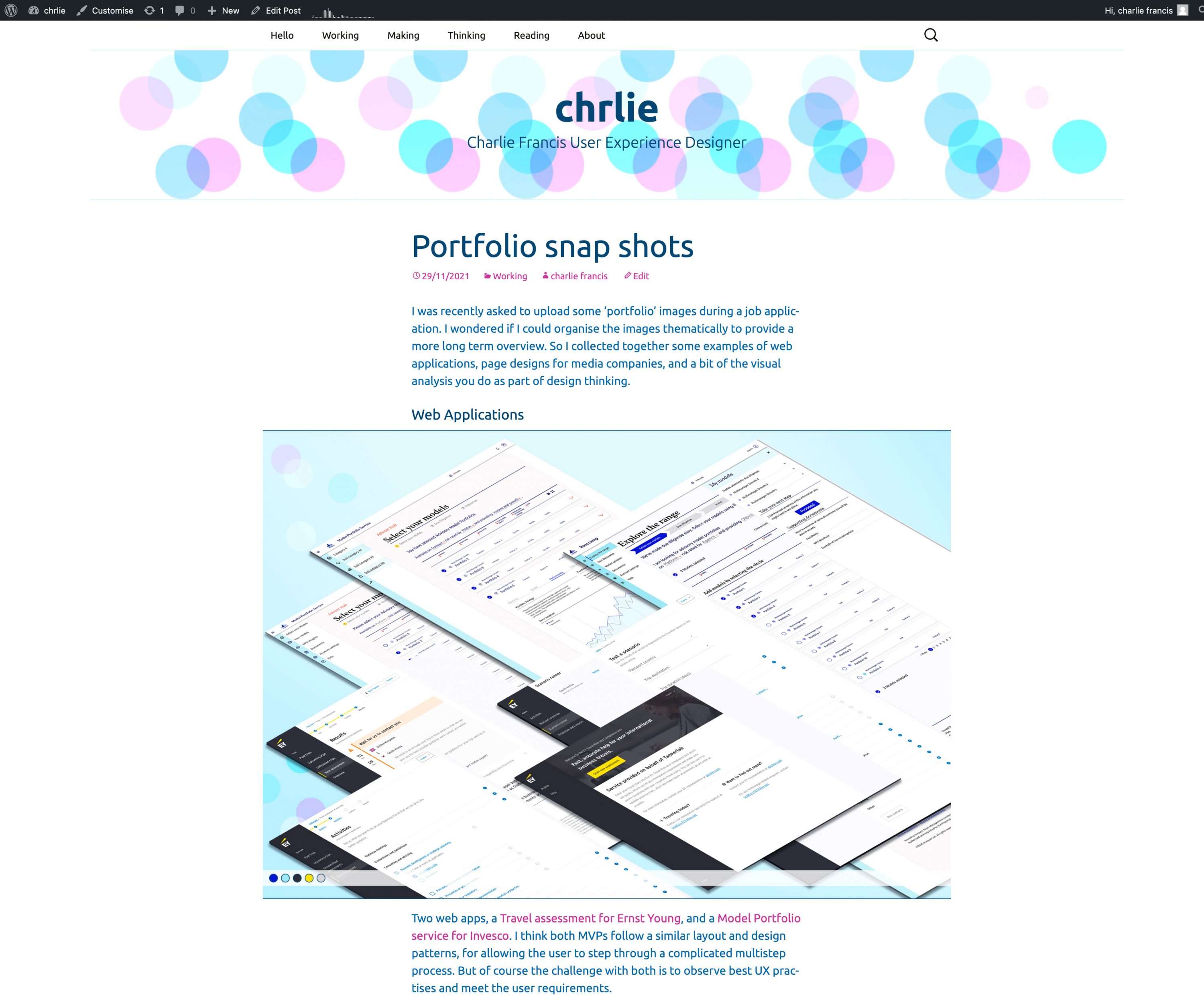
Updating my portfolio/ blog
Using the twentytwentyfive theme
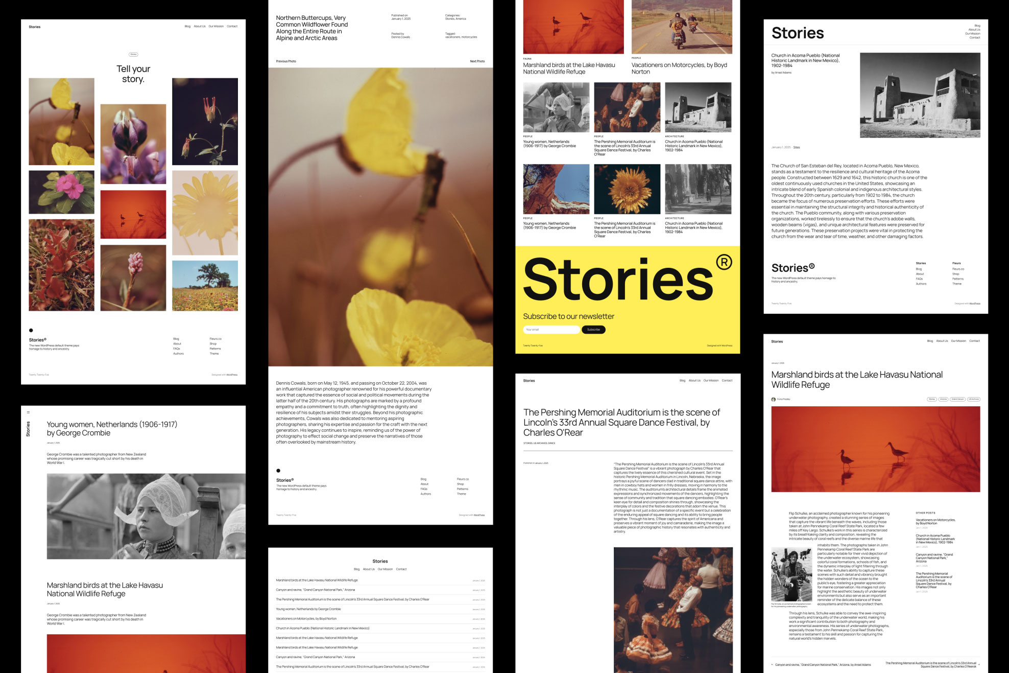
So I always try and use the default wordpress theme, which was the twentytwentyfive theme. One of the challenges of design is to work within existing constraints. The theme looks very good in the official previews. And as you can see from the mock up there even appears to be a masonry grid layout, a ‘Pinterest-style’ layout, which I thought this might be interesting for a sort of visual scrapbook aspect of the site. So I was keen to try that. Its also got the start of the sort of minimal clean layouts that I like.
Background
charlieMYK
My previous iteration of a wordpress site had used twentythirteen which I had chosen as the category lists had backgrounds that worked through various colours giving a striped appearance. I also was rather taken with the spartan look of the Ubuntu font family. Which I thought had a sort of modern brutal simplicity, they say ‘It has a contemporary style and contains characteristics unique to the Ubuntu brand that convey a precise, reliable and free attitude.’ I was at the time working as a freelancer and so my company name was ChrlieMYK, which was a play on CMYK colour printing, so the site featured a cyan and magenta colour palette. I previously had a freelance company called Halftonehouse, so that featured halftone and Ben Day dots from the colour printing processes. As I was just trying to update my blog I wanted to keep some of those aesthetics.
Inspiration and influence
Pelican covers, offset layouts and minimalism
There may be a certain amount of retrospective finding things that fit my existing palette, but Pelican book covers have great examples of magenta on their cyan backgrounds. There is a bit more about the colours in my posts, AI. Figma and colour scales and ramps.
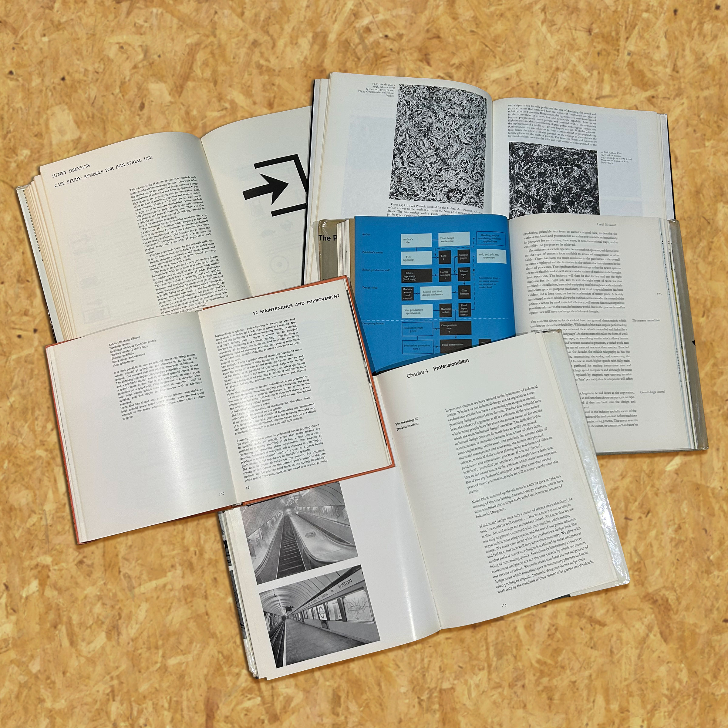
I have also been thinking a lot about text columns in offset layouts as I keep buying fifty year old design books from the 1970’s.
There is also a certain type of hard minimal modernism that the the twentytwentyfive theme may have had and I worry that I may be making it too busy and that I should be more spartan.
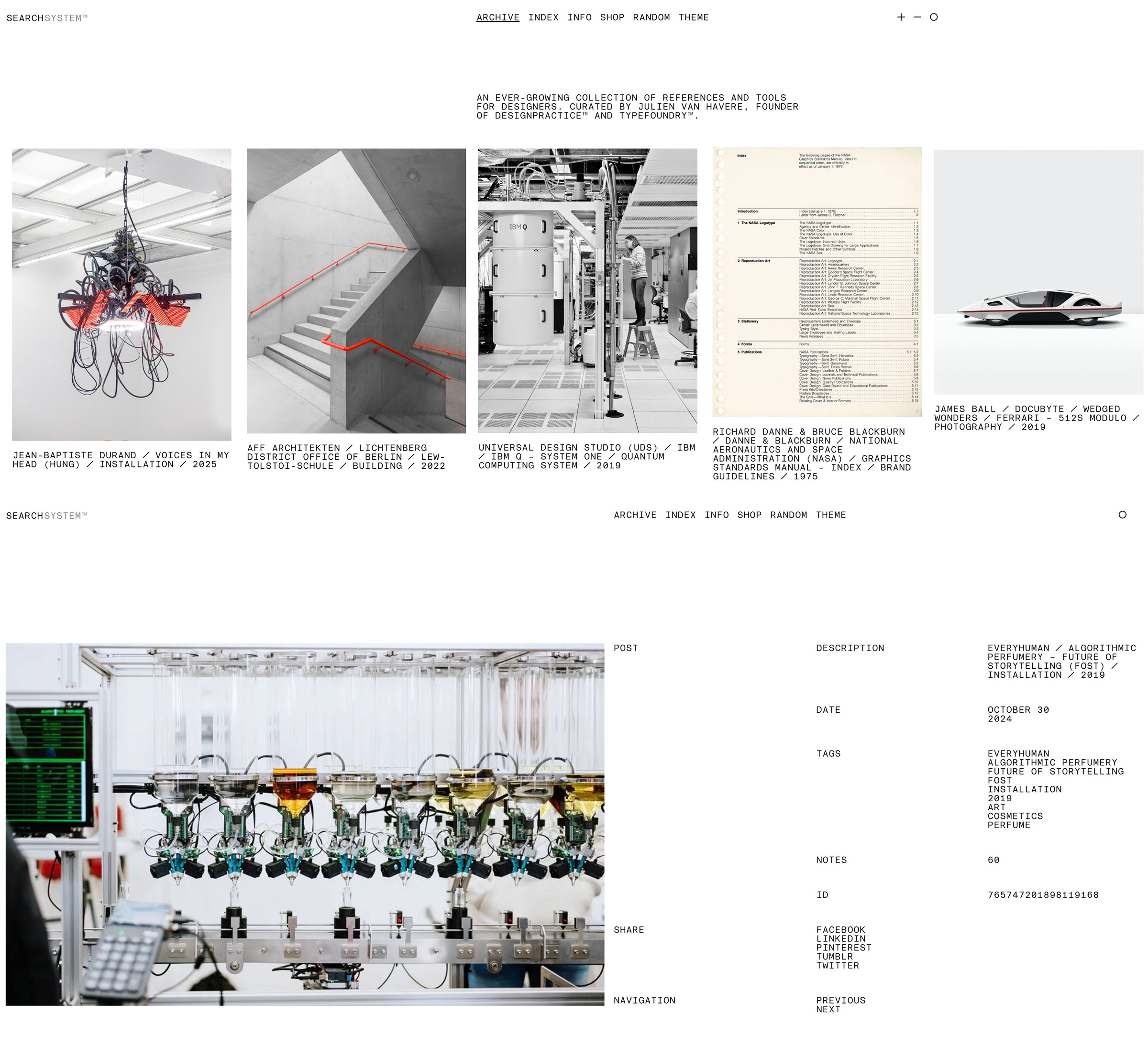
Certainly you can spend hours looking at minimal modernism on tumblr blogs like searchsystem.co which is a very addictive blog by Julien van Havere who is a founder of Design Practise andTypefoundry. I hope he doesn’t mind this collage of posts that struck a chord with me as I scrolled through.
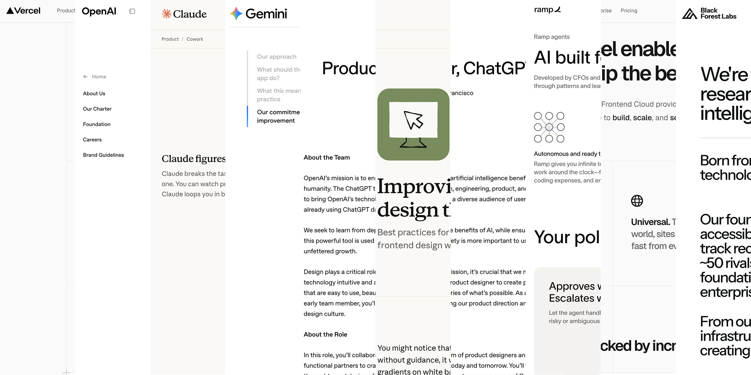
I can’t help but also notice that there appears to be a sort of minimalistic AI aesthic going on so I wonder if thats becoming a thing. I tend to feel its all going a bit pastel-taupe-Theodore Twombly-her-ish. So I need to balance my colour carefully as I’m already drifting into a dreamy colour palette of pale pinks and pastel phtalo.
At the other end of the scale whilst thinking about bold typography and title bars, I have always been very taken with the japanese magazine IDEA. Although it does change its title for every edition there are a few clean modern ones that I was very taken with. The default font with the twentytwentyfive theme is Manrope and I have compressed the letter spacing in some of the titles to give it that Unimark International feel.
I have spent some time trawling the internet for vintage magazines with elegant mastheads in order to inspire or justify using a bold sans serif with the letterspacing compressed in a sort of sixties style. I am not sure what it proves as I was also sidetracked by idea and brain magazine from japan. But I did discover some magazines have an online archive of their sites which was amazing.
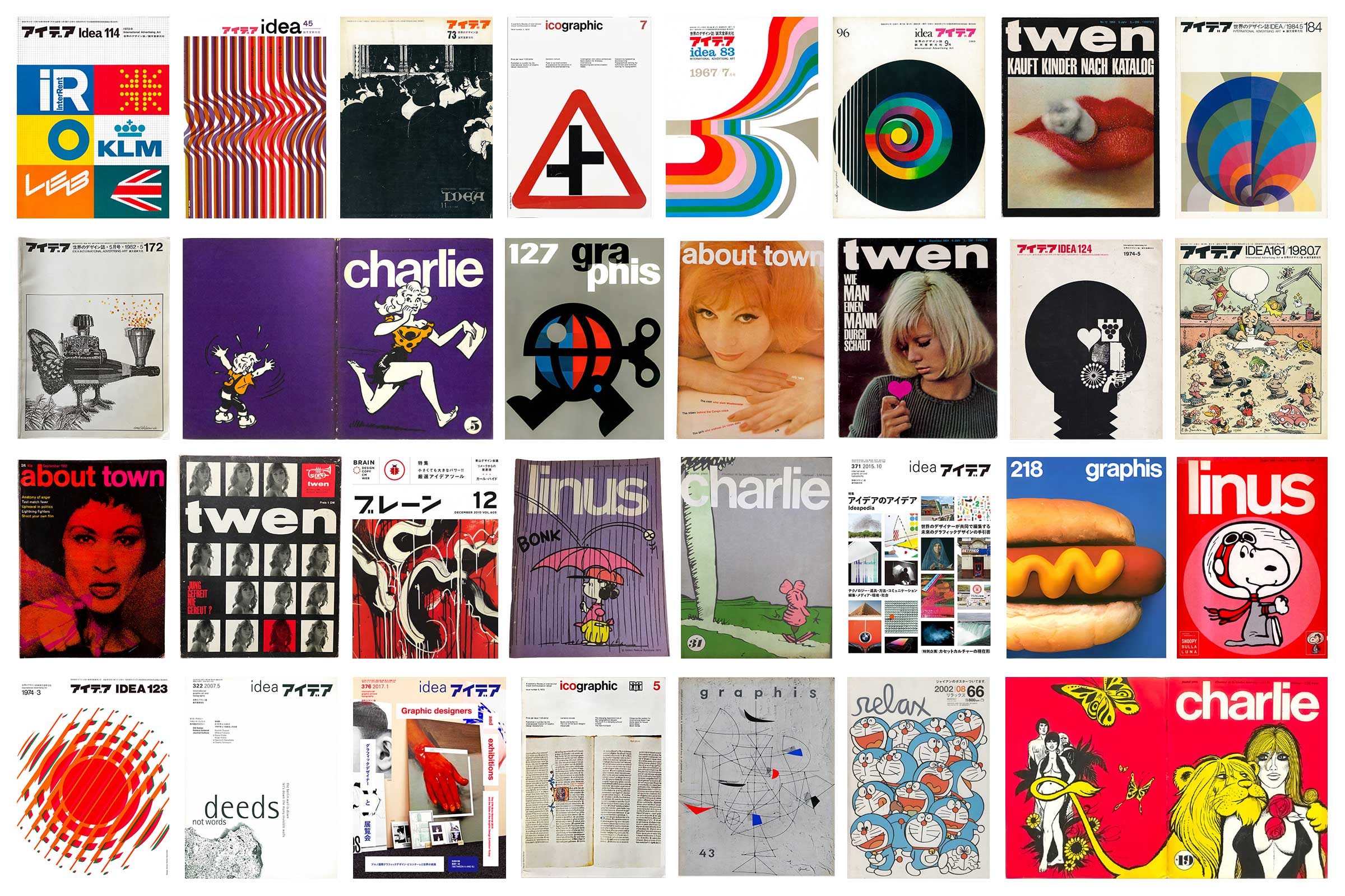
Graphis magazine have one from 1945-2005. Idea seem to have digitised all of them. Elegantlypapered have a fine selection of vintage TOWN, about town and some Twen covers. The Print Arckive also has a great if random selection of magazines and books from the sixties and seventies. There is also DesignReviewed where Matt Lamont’s magazine obsession seems to have become his business. He has quite a good selection of vintage idea covers as well. You can get some wonderful in depth reviews and examples at logoarchive. I even stumbled across a tumblr blog, Gurafika, just dedicated to surveying the history of graphic design in Japan.
Finally in a strange coincidence looking for sans serif bold titles I came across the french satirical comic monthly Charlie Mensuel (monthly) which I think evolved into Charlie Hebdo (weekly). There is a collection of the covers on comics.org, aka the Grand Comics Database (GCD), although some of them could be seen as a bit inappropriate by modern standards.
Conclusion
Using the twentytwentyfive theme
Just trying to outline in my head some of my design thinking for the look and feel of this blog. The next step is to look at the theme and see if I can optimise it to meet those requirements. Starting with how twenty twenty five’s colours are set up, and experimenting with the fonts, and layouts.
I have already implemented quite a bit of customisation, but to get the site ‘just right’ I am going to have do a bit of a deep dive on the theme to understand how all the default colour mapping for common blocks and elements works. Then look at how and where you can customise elements. It seems very difficult to have page subheadings without a plug in which seems odd. Working within a themes boundaries is often actually just discovering them.