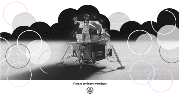
Its a web designer’s conundrum. That despite our best efforts some of the sites that are the most popular don’t appear to have a strong visual design. Some people might say they are ugly. It is a balancing act that is one of the great skills of visual design on the web. Usability, Information architecture and visual design all need to work together.
There seems to be an understandable anxiety amoungst designers that in a technology driven environment works well and looks good may be in conflict. Is it Jacob Neilsen’s ‘Why this site has almost no grahics’ vs Don Norman’s ‘Emotion and Design: Attractive things work better‘? There have been alot of great posts on the web about this. Robert Scroble’s interview with Markus Frind of Plentyoffish is a favorite of mine, he calls it anti-marketing design. In a very old article on the AIGA website David Vogler writes Its Good to be Bad. This piece was written about by to by Joshua Porter as the MySpace Problem. Finally Jared Spool asks Is Ugly the new black?
Personally I am not too worried and I think there is a cultural element to my thinking here. Happy is this web designer at on his ercol chair, plain and pratical. Is this a British mentality that comes into play? A distrust of the showy and decorative as it might get in the way of the useful and well organised. As Frank Pick put it, ‘The test of the goodness of a thing is its fitness for use. If it fails on this first test, no amount of ornamentation or “finish” will make it any better, it will only make it more expensive, more foolish.’ As a teenager I remember coming across this little article about the Colt .45, (boys will be boys), but I dug out my old scrapbook and took heart from the line, ‘what looks right is right’.

