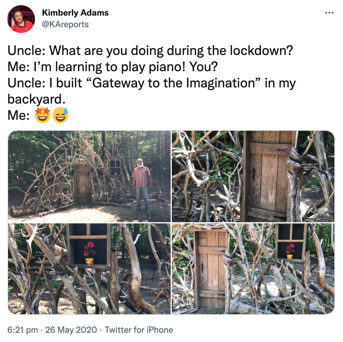
Best thing I have seen this year, reminded me of so may wonderful things…
Had to display a screenshot with a link to the tweet, as the twitter embed widget doesn’t seem to want to display correctly in this theme?
Best thing I have seen this year, reminded me of so may wonderful things…
Had to display a screenshot with a link to the tweet, as the twitter embed widget doesn’t seem to want to display correctly in this theme?
esoteric/ˌɛsəˈtɛrɪk,ˌiːsəˈtɛrɪk/adjective
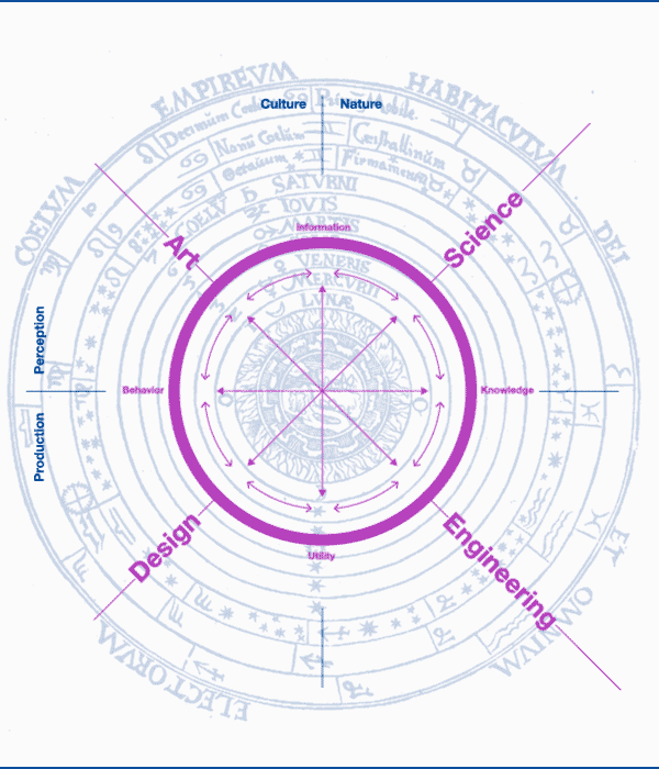
As a side project I was experimenting with the idea of how the language and processes of digital multimedia design have become more esoteric as it has become more specialised.
Continue reading Esoteric UX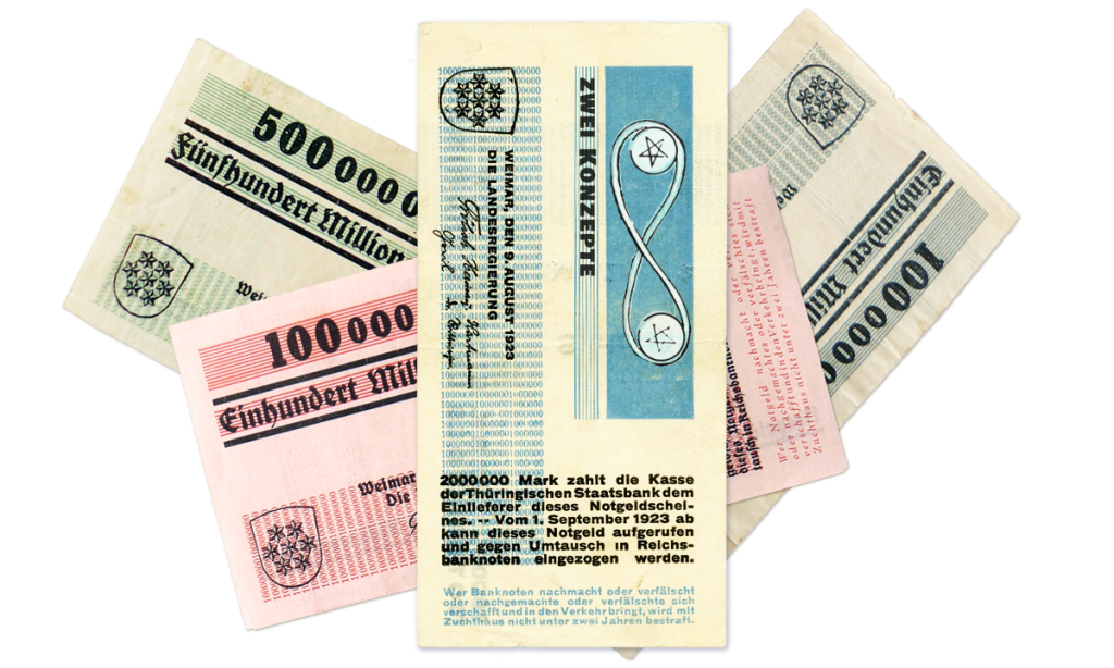
So I think this all about balance, in the traditional card a man juggles two coins held in an infinite loop. So you are trying to balance what I would consider two aspects of design. The customer/user side and below the line of visibility all the systems and processes. From the beginning designers have worked on the best tool to bring these two sides together.
Continue reading Two of NotesJohn Baldessari and Laurence Sterne.
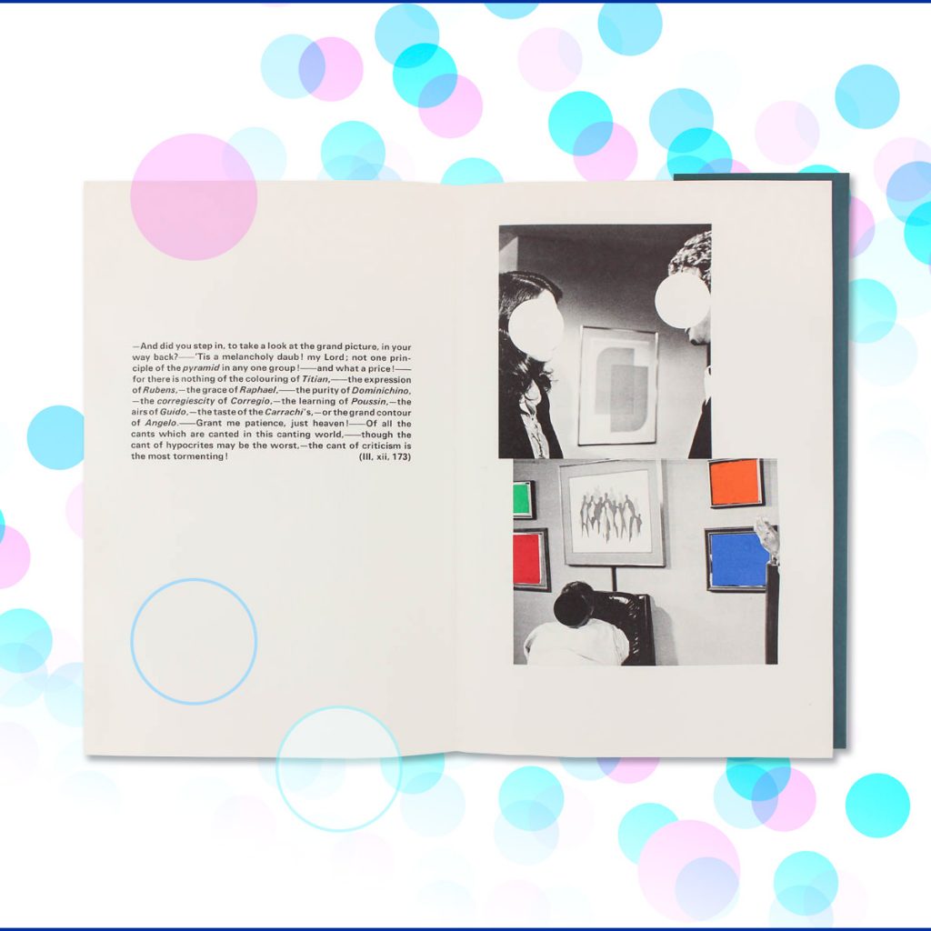
There is an edition of ‘The Life and Opinions of Tristram Shandy, Gentlemen’, written by Lawrence Sterne, printed by Arion Press with 39 photo-collage illustrations by John Baldessari in his own unique style. Discovered by coincidence after reading Baldessari’s obituary.
I have always liked the coloured circles on his photo-collages.
‘ I think what drives me is some elusive quality of trying to get something right.’
+
‘you will no more be able to penetrate the moral of the next marbled page (motly emblem of my work!)’
From a Baldessari short film by the Tate and Sterne trying to explain his book.
Continue reading The Life and Opinions of John Baldessari, artist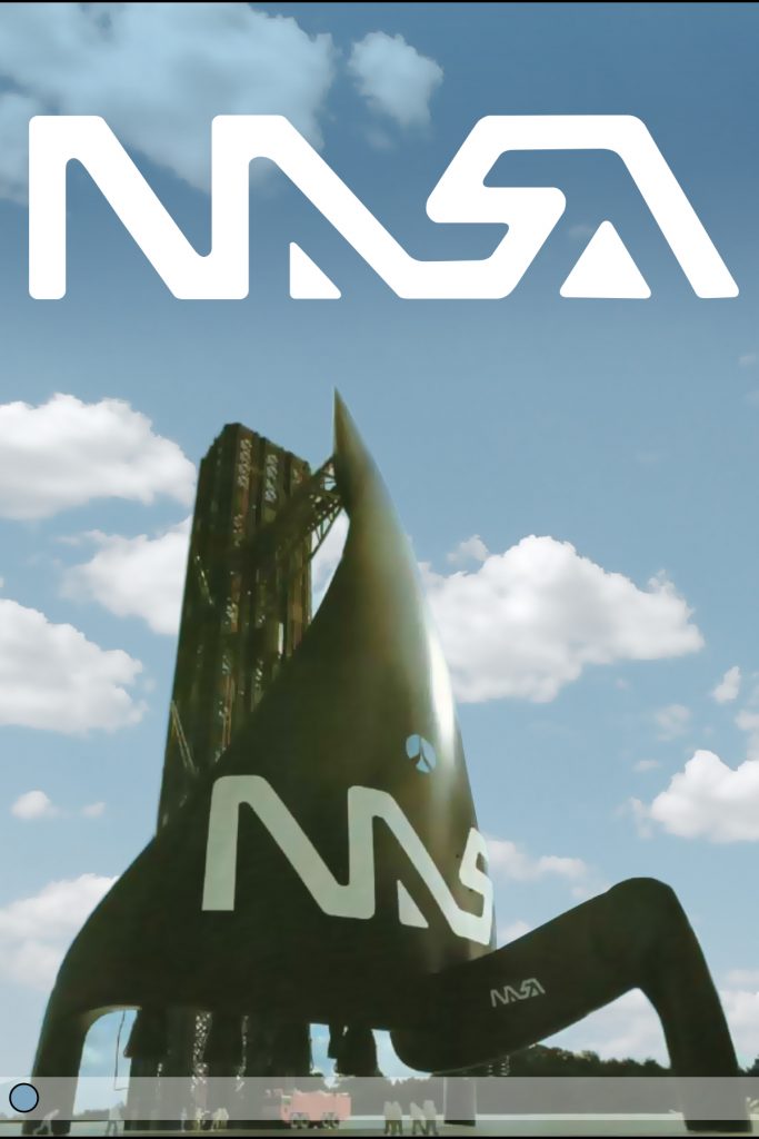
If the famous NASA ‘worm’ logo was ever to be brought back, maybe it could be revived in the form on this space shuttle concept, the Polymorph space shuttle design by Luigi Colani.
Continue reading Nasa logo redux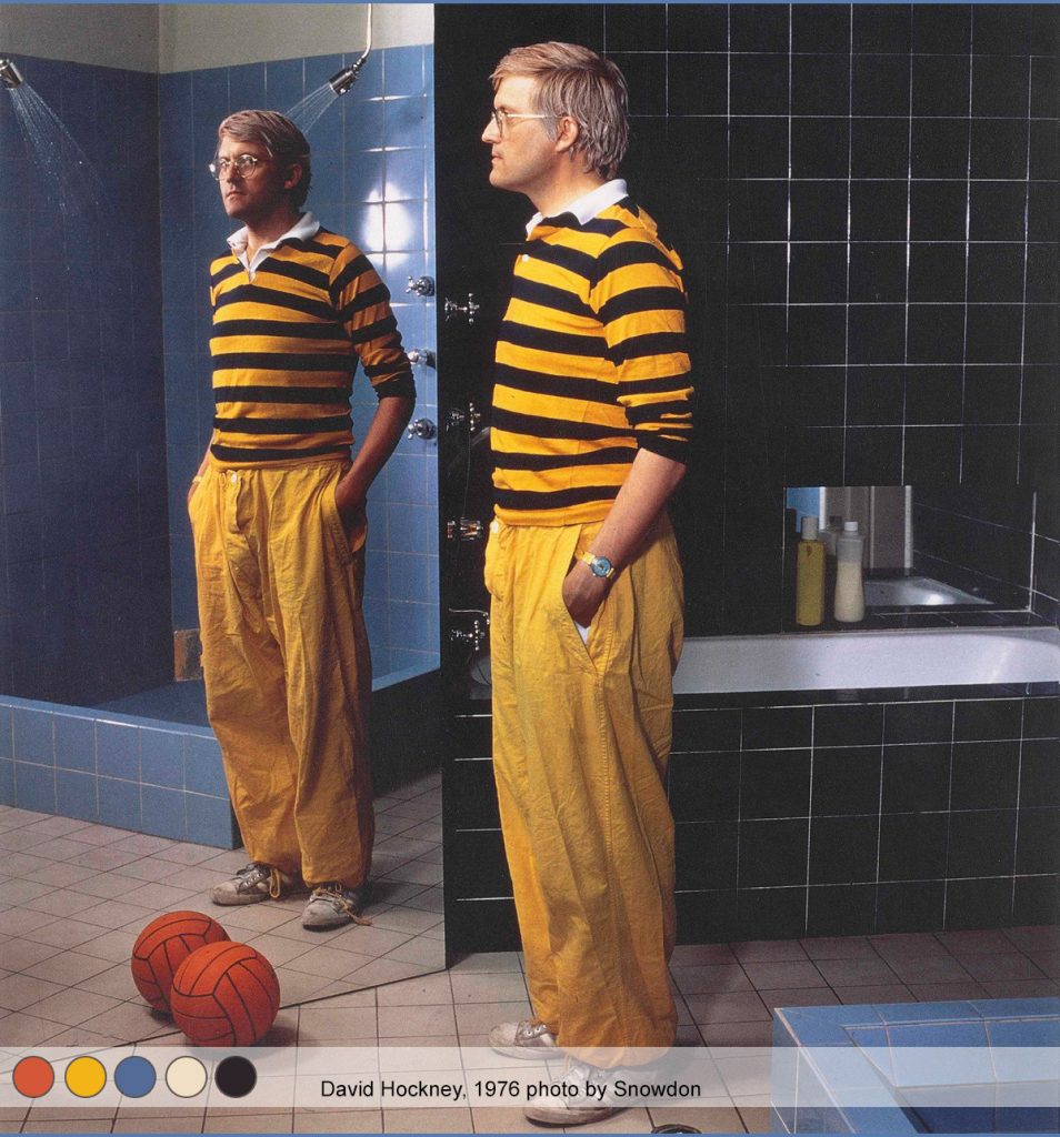
Who has an an orange football in their bath room? David Hockney.
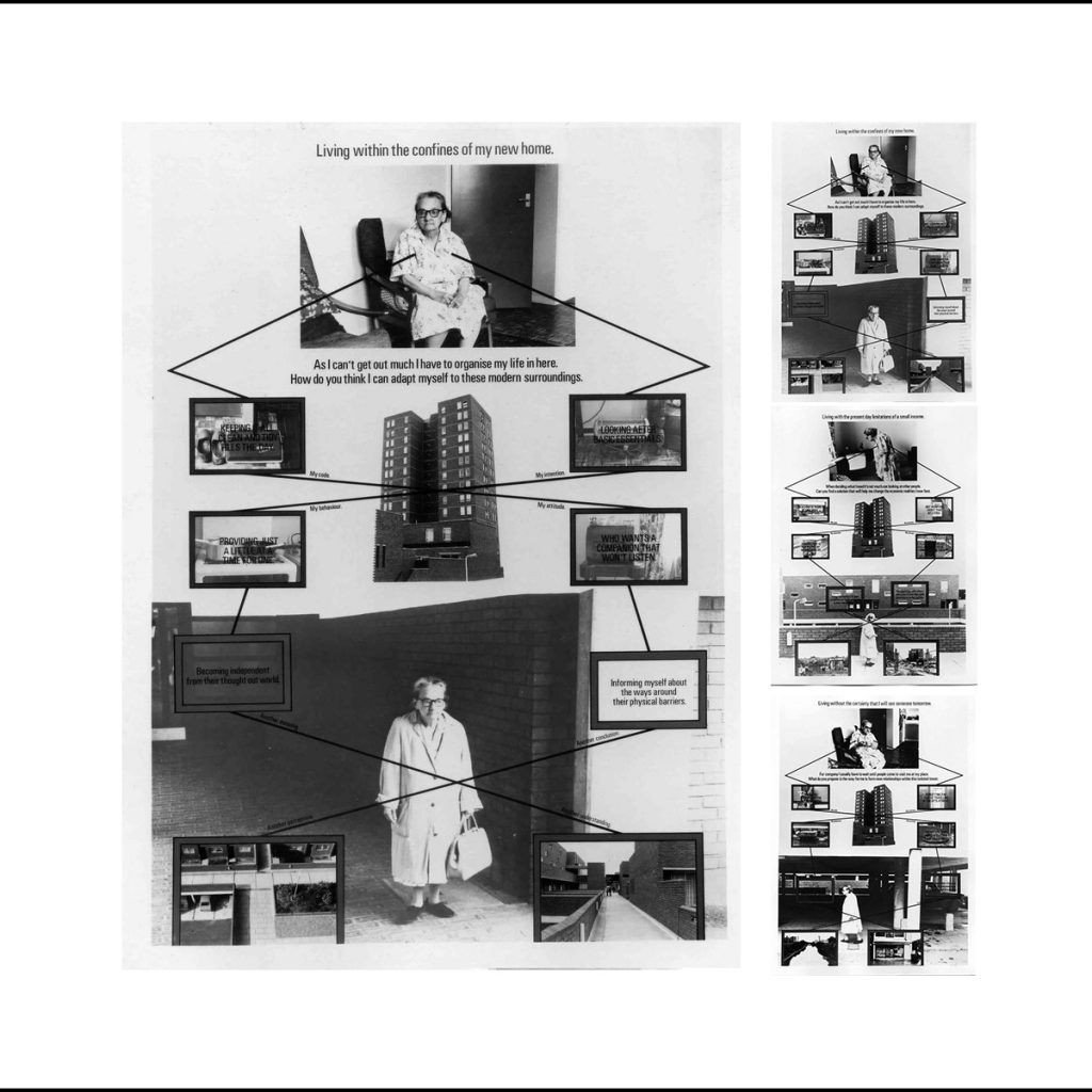
I saw these photo collages at the Tate modern ages ago and didn’t know what to make of them. Really struck me they were using the visual language of service design. But was very struck by their combination of messaging, diagrammatic structure and provocative text. I have spent a while looking around the internet and the artist Stephen Willats seems like both a creation of his time a sort of techno futurist of the sixties and seventies, (feels like early J.G.Ballard to me) and its eerily presentient of lots of service design ethnographic work. I have seen a few customer journey / day in the life diagrams that looked like his work.
Continue reading Stephen Willats , how tomorrow looks from then…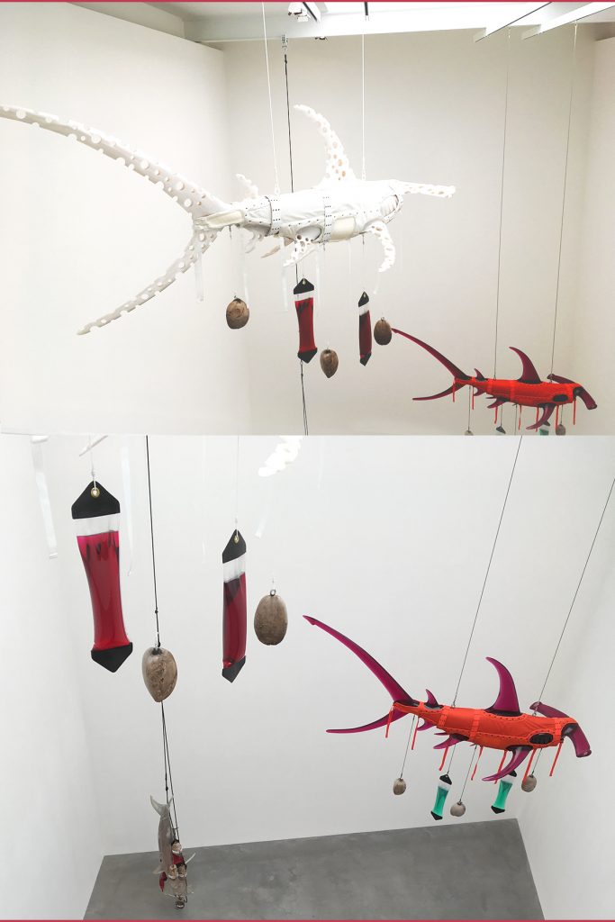
Went to see Ashley Bickerton’s show at Newport Street gallery and was very taken with the hammerhead sharks floating around the space. For me Bikerton is something of a throwback to the eighties/nineties New York art scene. But I first saw the shark idea at Serpentine galleries in a show called ‘Some went mad some ran away.’ It was in 1994 and was curated by Damien Hirst, so its funny to see Bickerton displayed again at Hirst’s own gallery twenty three years later. I do find his latest painting horrible though. But the show had a few of the his Floating Costume pieces which are fun. Every one needs an Elvis suit in a glass casket with giant orange floats.
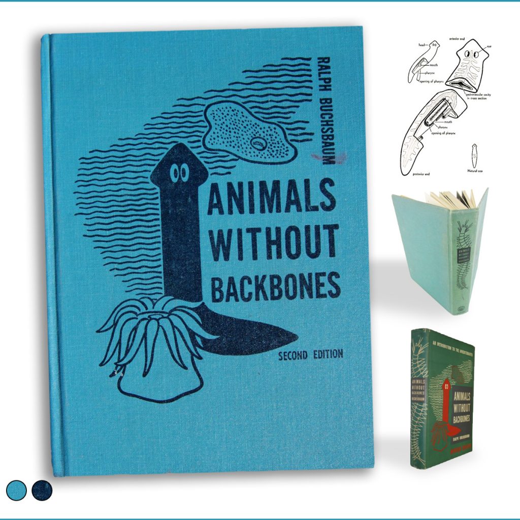
I came across this book cover a while ago, and thought it would be a great image to send to some one as an insult. But I got over that and in putting this collage together have been amazed by the wonderful work of the books illustrator Elizabeth Mabel Buchsbaum who was the sister of the author. There is a great profile over at the Indiana Illustrators and Hoosier Cartoonists blog. I just think the slightly startled flatworm in the middle is great. You can still buy it, as its considered the definitive text book on invertebrate animals.
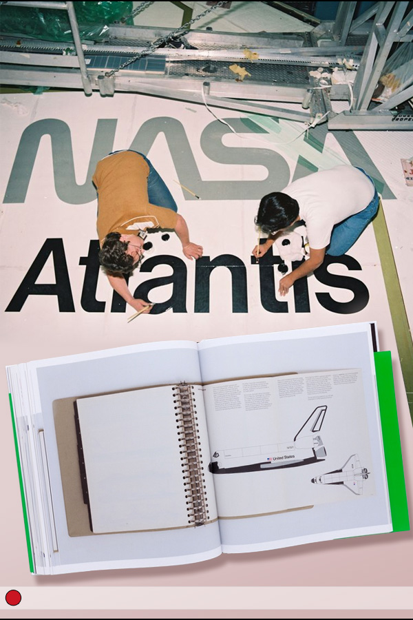
Thinking about branding at the moment and was reminded of this great photo of painting Atlantis name onto the space shuttles wing. Back when NASA was still using the ‘worm logotype’. Unit editions have printed the guidelines in their ‘Manual 1 Design & Identity Guidelines.’ NASA have also shared the guidelines here.