A very big audience
CNN has a giant audience, and 10 to 20 percent of those users could need help accessing CNN’s digital content. CNN currently claim, a global audience of 170 million unique multi-platform visitors for August 2019.
The United States census bureau reports that about 56.7 million people, 19 percent of the population have a disability. According to a broad definition of disability, and the world bank claims 15 percent of the world experience some form of disability. Looking at the US census figures 8.1 million people had difficulty seeing, including 2.0 million who were blind or unable to see. Also For example, the AFB, American Foundation for the Blind, has findings from the 2017 National Health Interview Survey (NHIS) data release established that an estimated 26.9 million adult Americans (or about 10% of all adult Americans) reported they either “have trouble” seeing, even when wearing glasses or contact lenses, or that they are blind or unable to see at all.
I am not sure if you can extrapolate from the US national and UN global figures what number of CNN’s unique audience might have a disability that hinders their ability to interact with CNN’s digital content, but it feels like it is large enough that accessibility should be a priority for CNN. Our hope is that by incorporating accessibility into the CNN Design System, we could bring everything up to AA level of compliance.
Accessibility cascades through your site
Every aspect of CNN web development process will have an impact on how accessible the digital offering will be to the user. With the design system we focused on complying with WACG (Web Content Accessibility Guidelines) 2.1 Level AA. The design system builds accessibility into each component, whilst also describing some general guidelines. Inspired by Jesse James Garrett’s very famous diagram ‘The Elements of User Experience’ we attempted to describe how each layer of web development should incorporate accessibility.
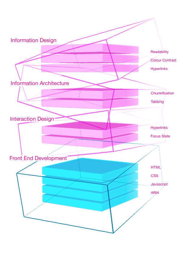
Designing for accessibility we wanted the experience to be simple at the front and smart in the code. We started with the ‘Design of the Information’, legibility, readability, colour and contrast , all determine how the content is presented to improve understanding. This led on to the ‘Information Architecture’, how the information is structured and laid out. Both are impacted by the ‘Interaction Design’ and improving accessibility here helps all users feel in control of the content. Finally front end development, from the HTML, CSS, Javascript, and ARIA. Being smart in the code ensures the site is as accessible as possible.
Information Design
Readability
CNN’s constant stream of breaking news with a mixture of long and short format pieces and the increasing use of the Live story format, means paying attention to the formatting of the text. Starting with line length and character count, for all users the WCAG recommends, ‘A line of text shouldn’t be longer than 80 characters. This helps users with certain reading or visual disabilities that have trouble keeping their place when reading long lines of text.’
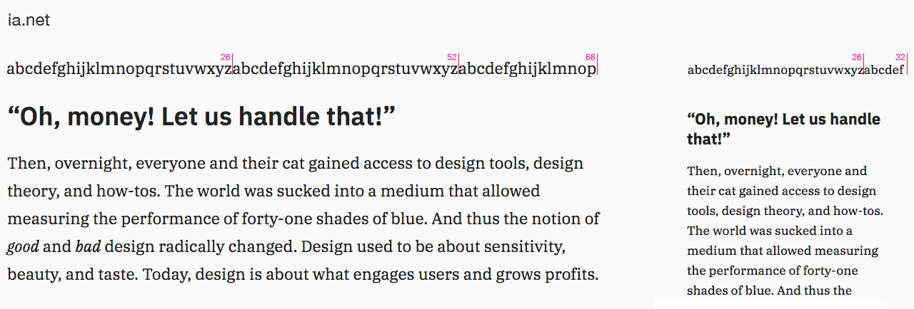
My two favourite resources on this are the Baynard Institute and ia.net. For basic readability the Baymard Institute (an independent web usability research institute focused on all aspects of the e-commerce user experience), ‘In order to avoid the drawbacks of too long and too short lines, but still energize your readers and keep them engaged, we suggest keeping your text within the range of 50-75 characters per line.’
Looking at examples across the web, there seems to be a sweet spot of between 60-70 characters for a desktop line length. CNN’s smallest mobile screen size is 320 so I don’t think line length is indicative of readability as the character and word count will always be very short.
Sampling and comparing, CNN, BBC, Washington Post, Medium, iA.net and Politico. Clicking on each image below will show it at full size in a new browser tab.
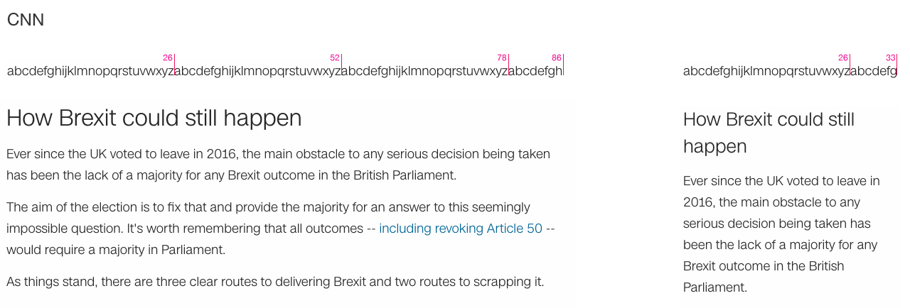
CNN has a very long character count on desktop, and the body copy size is 15 px (as measured by chrome inspector web tools) which in CNN sans appears visually to be quite small.
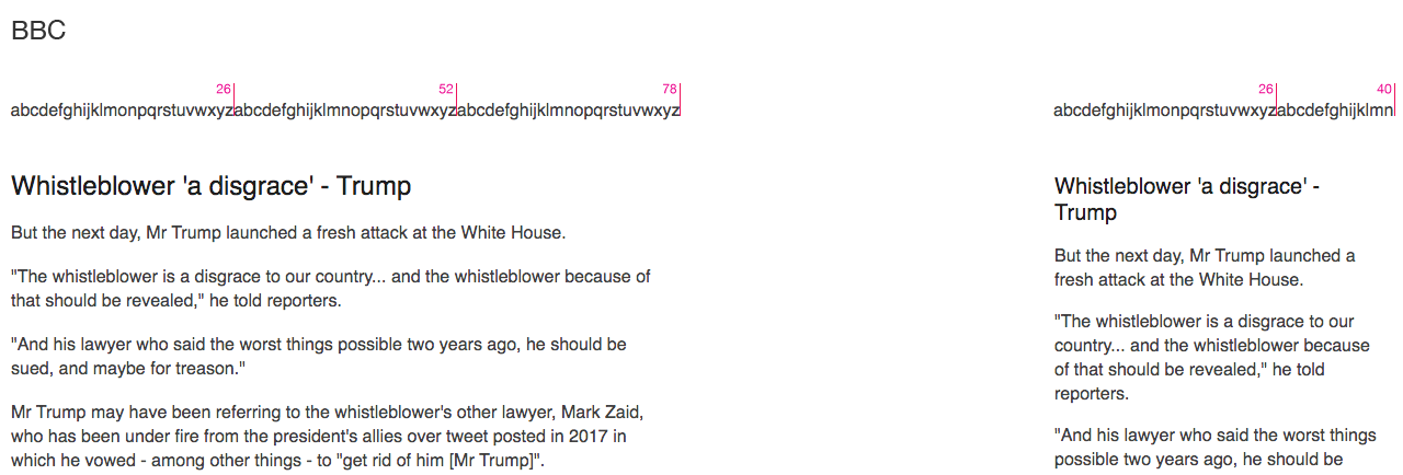
The BCC has a shorter line length, a slightly larger font size but with their font this visually appears to look smaller than CNN.
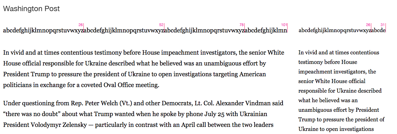
The Washington Post uses Georgia which I suspect aligns with their brand, and at 20 px and quite a strong font weight.
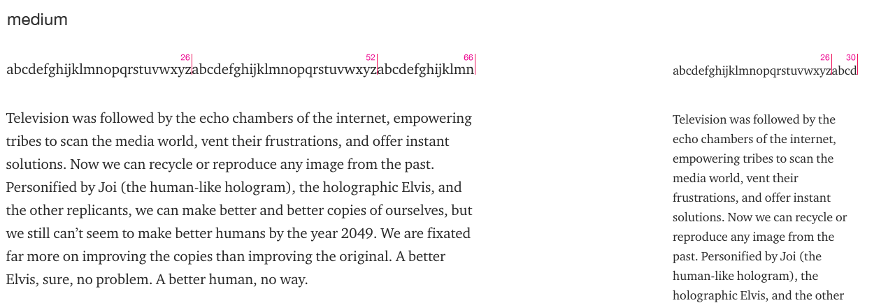
Medium is a smidgen larger at 21px but appears to be slightly lighter in font weight.
Although not an editorial news site, I have included as an example of practising what you preach. A large copy size at 21px like medium.
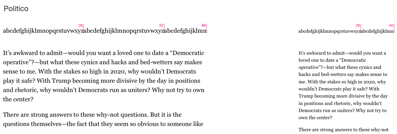
Finally I included Politico as they seem to have the balance right a short line length with an 18px font size.
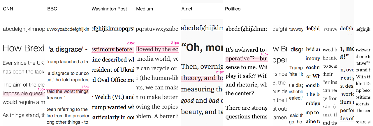
Looking at the line length on CNN its probably a bit too long on desktop.
The body text is in CNN sans, at 15px on desktop, which seems small. But CNN sans is a clear open sans serif font, visually it looks larger than the BBC copy font despite the CSS indicating otherwise. Its not an easy comparison with other sites as different fonts and how they are described in CSS and their actual visual size. What is 14 px in one font can be equivalent to 16 px in another. So for the sake of comparison I have looked at the css and highlighted the font based on that.
For readability a sans serif font is preferred fontsmith have written up their work on creating accessible fonts. ‘Our research in conjunction with Mencap indicated that sans serif fonts were considered the most accessible style. The level of detailing within serifed letters was considered overly complex by those with reading disabilities. Sans fonts have a simplified structure; their forms feel closer to our learned handwriting and therefore were deemed more legible. In browser, mono-linear sans letters display more cleanly at smaller pixel sizes, particularly in the harshest rendering environments.’
So that would seem to favour CNN sans which is great.
For font size and line length we need to account for CNN audience as a whole. The largest segment of the USA’ population is still the boomer generation born 1944-1964 age 55-74 years old (74.1 million or 22.9% of the US population). An age when your eyesight begins to decline, with it becoming harder to focus on nearby object, such as within arms length, so you end up with reading glasses. More seriously up to 4 million americans are said to have low vision, a visual impairments other than blindness. Sometimes referred to as being partially sighted or sight impaired. For these users shorter line length can be helpful as it can be difficult to move from the end of a line of text, to find the beginning of the next line. 50% of the US population have corrective glasses. So most accessibility guidelines now recommend a font size of 16px and the WACG specify can to control the text size anyway. So if they need to they can make it larger.
I think CNN sans is a good font in that clear sans serif fonts are favoured for accessibility. But I would consider slightly increasing the font size on desktop, and having a shorter character count per line. Visually the narrower text columns of Medium and Politico seem easier to read. So some small changes will help everyone find the page more readable, and accessible.
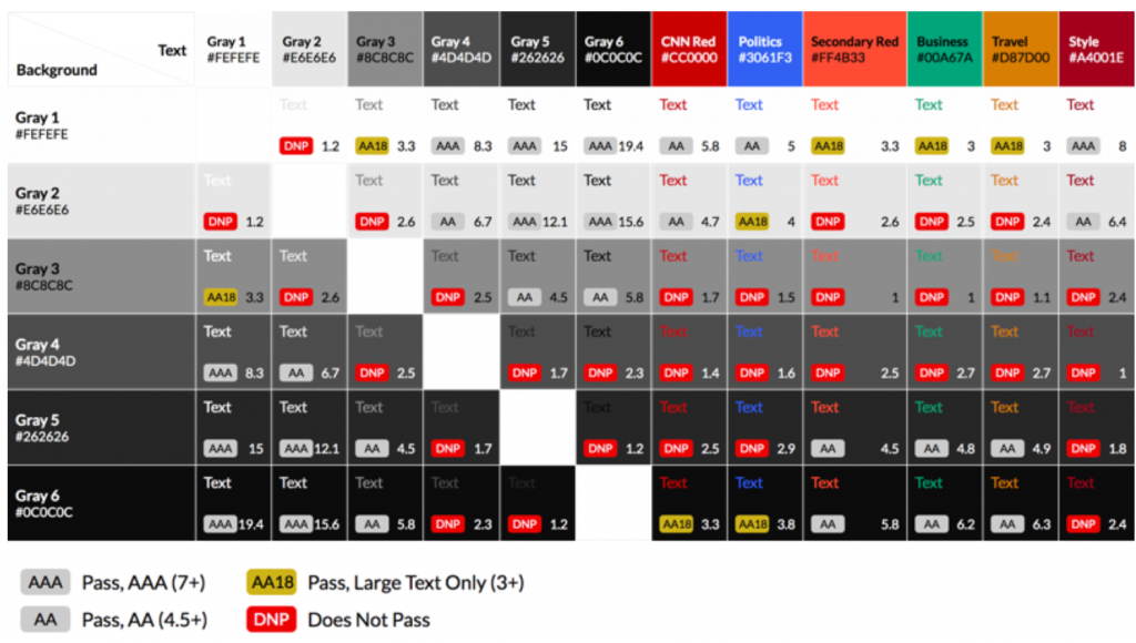
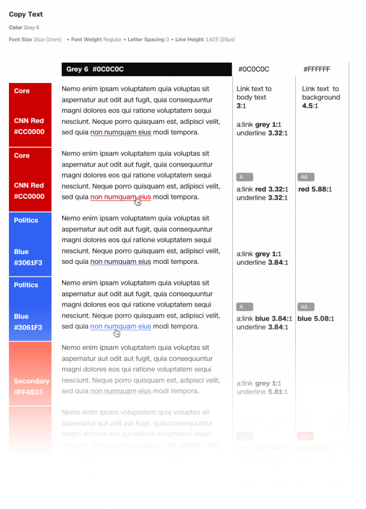
Colour, Contrasts
As part of our accessibility audit, we reviewed the CNN colour palette and adjusted the colours so we met the contrast value of 4.5:1 for level AA. The WCAG 2.1 guidelines state
1.4.3 Contrast (Minimum): The visual presentation of text and images of text has a contrast ratio of at least 4.5:1, except for the following: (Level AA)
- Large Text: Large-scale text and images of large-scale text have a contrast ratio of at least 3:1;
- Incidental: Text or images of text that are part of an inactive user interface component, that are pure decoration, that are not visible to anyone, or that are part of a picture that contains significant other visual content, have no contrast requirement.
- Logotypes: Text that is part of a logo or brand name has no minimum contrast requirement.
and hyperlinks…
In reseting the colours, we also took into consideration that colour should not be the only way of conveying information. We were keen to underline all hyperlinks. This however wasn’t possible on the homepage, as visually it would have overloaded an already busy page. Most users will realise that the the story headlines on the homepage are links.
Unfortunately CNN red #CC0000 will become grey if you are colour blind and so wouldn’t stand out as a link colour alone alongside the black #000000 body text colour. So in some cases the brand red will over ride accessibility considerations. But usually we were able to balance out the conflicting requirements.
So colour and contrast led us to reviewing all the styling for hyperlinks.
Information Architecture
Chunkification
I first came across this phrase years ago at AOL, to describe how information on the page should be broken into clear chunks that guide the user easily through the content, creating a clear structure to information. Editors should be breaking up large stories with headers to make make the understandable for every one, including people using assistive technology like screen readers.
As Mozilla point out, a well structured page, that has semantically correct HTML is also great for assistive technology like screen readers.
‘The most important quick win in semantic HTML is to use a structure of headings and paragraphs for your content; this is because screen reader users tend to use the headings of a document as signposts to find the content they need more quickly. If your content has no headings, all they will get is a huge wall of text with no signposts to find anything.’
Looking at news website there doesn’t seem to be a lot of use of subtitles to break up the content. I think this could be an easy win to make the pages more accessible.
Tabbing
Another aspect of breaking the page up into meaningful units, chunks comes into play when you start to consider keyboard navigation. Users with certain disabilities may have no choice but to use a keyboard. Users with motor impairment may have difficulty with fine movements of a mouse, and blind users rely on assistive technology such as screen readers. Using a keyboard there is no cursor on screen, so the focus state of the selected item needs to be very clear. Displaying focus is a s a default in all common browsers. But it can be turned off in the HTML. Don’t.
Its worth noting that tabbing through content will jump between the inline links in the content. So links should make sense out of context, so ‘Click here’ or ‘Read more’ links aren’t helpful.
The user should also be able to avoid having to tab through all the navigation if a ‘skip to content’ link is provided before the navigation.
Interaction Design
Underlining Hyperlinks
In reseting the colours, we also took into consideration that colour should not be the only way of conveying information. We were keen to underline all hyperlinks. This however wasn’t possible on the homepage, as visually it would have overloaded an already busy page. Most users will realise that the the story headlines on the homepage are links.
Unfortunately CNN red #CC0000 will become grey if you are colour blind and so wouldn’t stand out as a link colour alone alongside the black #000000 body text colour. So in some cases the brand red will over ride accessibility considerations. But usually we were able to balance out the conflicting requirements.
So colour and contrast led us to reviewing all the styling for hyperlinks.
Focus state
If the user is navigating through the content with a keyboard being able to clearly see the in focus element that the user has tabbed to is essential. I would argue is difficult at the moment to navigate a CNN pages by tabbing, as it is not always clear what element is in focus.
One of the mistakes that is made is that an element that can become in focus sits in a colour that is the same as the browser focus state indicator. So a link on a blue backround won’t be visible if the browser default focus state is blue.
Front end development
This final layer is in many ways the most important, if CNN is smart in its code, it will make life so much easier for assistive technology. I feel this is outside of the remit of visual and UX design. But I am hoping that by including real code based examples in the Design system there will be the opportunity to highlight the best practises mentioned below.
Semantically correct
Out of the box, HTML is accessible, if used correctly. So most web content can be made accessible just by making sure the correct Hypertext Markup Language elements are used for the correct purpose at all times. But with richer interactions, dynamic content, it becomes harder for the code to remain accessible. So WAI-ARIA adds an addition layer of help to assistive technologies, like screen readers.
WAI-ARIA
Which stands for Web Accessibility Initiative – Accessible Rich Internet Applications and is described by W3C Web Accessibility Initiative as,
‘Languages used to create rich and dynamic web sites, e.g., HTML, JavaScript, CSS, and SVG, do not natively include all the features required to make sites usable by people who use assistive technologies (AT) or who rely on keyboard navigation. The W3C Web Accessibility Initiative’s (WAI) Accessible Rich Internet Applications working group (ARIA WG) is addressing these deficiencies through several W3C standards efforts.’
WAI-ARIA Authoring Practices 1.2 W3C Editor’s Draft 11 November 2019
There is a gap in ARIA as it is facilitates keyboard and assistive technology it may not be supported by mobile browsers or touch interfaces.
Great start
CNN has made a great start incorporating accessibility into the Design system and I hope that it continues to evolve and develop. So that rather than accessibility being an ‘added benefit’ it becomes ‘essential’. The designer team now check their work mets Level AA . Hopefully it will grow and reach the editorial and developer teams at CNN as well.