Creating a triple A design system
CNN had embarked on a harmonisation project, one aspect of which will be to create a cohesive design system. CNN is a complex network of departments and siloed teams and they have an ever increasing number of layers that must work together to create a consistent experience. As part of the London based ‘Shared Web capabilities team’, I was lucky enough to be able to work on a proof of concept for the design system.
As a small cross functional team, we could rapidly create a prototype for the design system, and build it out iteratively, collaborating with our colleagues across the whole company. As with all design systems, the need to socialise the system to other CNN designers, developers and the larger corporate stake holder community was vital. Fortunately Maz Ashton-Booth (Design manager), John Wood (Senior product manager) and Zoltán Lantos (Technical Manager) were tireless in advocating and championing the design system.
Auditing
One of the goals of a design system is to create consistency by simplification. With any large corporate sites there is a sprawl of unique components. So the whole design team spent a lot of time auditing the CMS and existing inventory of components and agreeing the best examples, which could then be fed into the ‘Pattern library’ part of the design system.
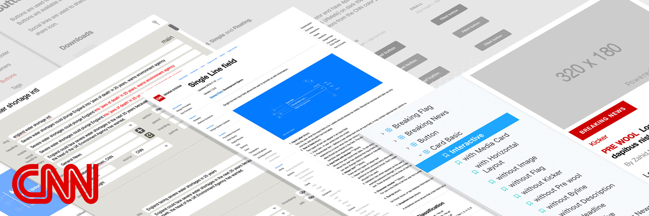
Maz scheduling and ran weekly meetings with all the designers, developers and stakeholders which allowed every one to present and review their components. We created examples of the components in sketch, and documented them in Dropbox. The agreed components and their requirements were then exported as markup, so that they could be imported into Storybook, and published. All the designers across CNN contributed components in Sketch, building an extensive library of symbols that could be re-used across projects, and realised as actual components built with React and then showcased in Storybook.
Advocacy
Getting support for the design system is often the most under-estimated aspect of the project. At the beginning you are balancing one team documenting and every team contributing. There is the challenge of creating a centralised resource when the teams and processes are distributed and federated. At the start the process is centralised but as every one begins to participate it quickly becomes distributed to all the design teams. All you can hope for is that the effort involved is recognised and very one is happy to co-operate.
I am always reminded of Danne & Blackburn’s tireless work advocating their redesign of Nasa logo. I acknowledge that selling a redesign is harder than getting buy in for organising an existing design culture into a design system. But it is my favourite example of how important getting buy in for the system is at all levels of an organisation.
In their introduction to the reprint of the Nasa Manual by Danne and Blackburn, Richard Danne explains how much effort they spent on communicating their designs, ‘Blackburn and Danne were sent on a tour of the Nasa campuses, in order to re-sell their work to the local administrators and quell the outrage. Danne recalls the visit to Houston, where Chris Kraft – the flight director of mission control during many of the space program’s triumphs – was running the Johnston Space Center. Kraft had been intensely annoyed about the redesign, and sat through Danne and Blackburn’s presentation skeptically. But at the end, he came round, saying, ” Why wasn’t it handled this way from the start? I don’t have to like it, but I can see it’s a real program, and I am okay with it now.” The designers’ reasoned approach hadn’t won everyone over, but it was enough to make the program stick.’ From, Are you team Meatball or Team Worm? by Christopher Bonanos.
As Richard H. Truly the Administrator of NASA wrote in his introduction to the new NASA Graphics Standards Manual in 1976, ‘My experience has shown that, in order to succeed, a program which departs from the accustomed must have the full support of every NASA employee. Top-level management must take the lead, our experts in the field of graphic design must follow, and all of us must see that the specifics are diligently monitored to insure that standards of excellence are maintained.’
Despite my NASA example showing how difficult it can be, I think every on at CNN could see the benefits of establishing a design system. Despite the inevitable endless debate about buttons, all the designers seemed to be willing to adopt it, and it became part of their everyday working processes, and we chugged along pretty smoothly.
Accessibility
I really wanted to raise awareness of Accessibility, as its the best constraint that you can have in creating a design system. Its simple to test, and benefits every one, but for some reason is often seen as a secondary consideration. At the most basic level we looked at the colour palette.
For example as part of the review process, we audited CNN’s colour palette. CNN faced a particular problem in that its core brand colour is CNN Red #CC0000, would displays as grey if you were colour blind. Also using the red as a link colour would be problematic as the contrast with the body text at #262626 isn’t great. Sometimes using the brand red over rode accessibility considerations. But most of the time we were able to balance out the conflicting requirements. But we were able to tweak all the other colours and get them accessible.
I have written a longer post about accessibility at CNN, but I think I was most pleased to be able to bring it into focus again as an important consideration at CNN. I don’t think there was ever been any resistance, it’s just with so many other things to think about, it had fallen by the wayside. But accessibility is an easy fix and the benefits always outweigh any issues with implementation.