Large corporate website are constantly changing. New products to promote, and new commercial goals. The users needs change from desktop to mobile, from mouse to touchscreen, from static to dynamic. An existing web site can begin to look tired, staid and incoherent. Over time each area of the site has created a solution unique to their needs, and so has moved away from the simple templated site of the original. It begins to feel as if design and the user experience is becoming arbitrary. Every one starts getting nervous and asking for a redesign.
Rather than redesigning the site can you evolve what you have?
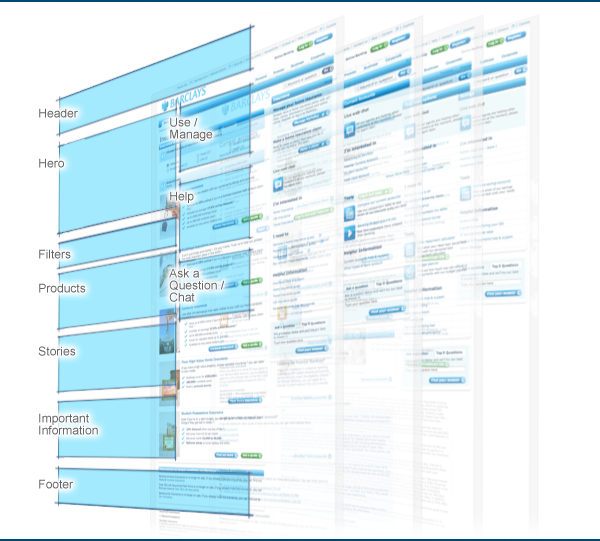
I am very interested in the idea of a consistent information hierarchy within corporate webpages. I asked the design team to audit the pages and come up with what seemed to be the most common ordering of the content. The audit showed that there was still an established information hierarchy that could be built on to create a cohesive user experience. It was also great that this hierarchy still felt appropriate. Through conversations and workshops with my UX design team we are building a common understanding of where we are going. I like to think of it as an informal discipline. The designs evolve to a greater cohesion through a process that is informal and leaderless. Designer have autonomy within their projects, but work within a discipline set by the team.
Often the pages you like the most, are the ones that had the most constraints. For example the content management system has a very long release cycle for new layouts, and components, it is difficult to alter body font sizes and stylesheets that are not yet coded for responsive layouts. Migrate much of the existing content rather than rewriting it. So with these constraints the UX team adapt and evolve the existing page hierarchy.
We removed the right hand rail and let the content breathe. Creating full width designs that had more of a chance on desktop and tablets. The aim being to give as many pages as possible a cohesive structure and hierarchy, so that when it came to making them responsive, they could just be migrated rather than redesigned. The designs and user experience evolve in response to a changing environment. But the pages are designed to anticipate the leap into responsive.
I think corporate websites are too big to redesign, they evolve, slowly the user experience improves, and your team create the consistency, quality, and cohesive designs that achieve an effective user experience.
a. Barclays Bank Account screen becomes full width and the content becomes more clearly segmented, giving a sense of hierarchy.
b. Barclayloan screen, builds on this incorporating existing filters and tools.
c. Barclays BMB screen, becomes more tablet friendly, but also explores different picture treatments as you scroll down the page to also indicate the information hierarchy.
