The user’s dashboard should be an honest, fun, collaborative, conversational, engaging interface that lets the user control their money in the Ginkou bank. So that they feel that they have control of their finances. The bank is supporting them in achieving their goals in life with simple financial management. The dashboard represents a move away from reporting financial data to the user and towards engaging with them in designing the best financial outcomes for them.

Users want their content personalised and presented in a simple and elegant format. It is the users financial data, and it should tell them their story. To understand that story they should be able to personalise it. Provide a flexible user controlled modular layout. The user can customise the layout by ‘drag & drop-ing’ the modules to create a bespoke design. If the users don’t want to organise their dashboard the default layout follows a logical information hierarchy.
The dashboard provides users with a single view of Ginkou Banks secure and public web services and products. Making it easier for users to manage their banking online and for the bank to promote additional products and services. A modular layout allows Ginkou bank to combine banking tasks and discovering banking products. The modules can be used across all digital devices to creates a consistent user experience, and allows for the easy development of a responsive design.
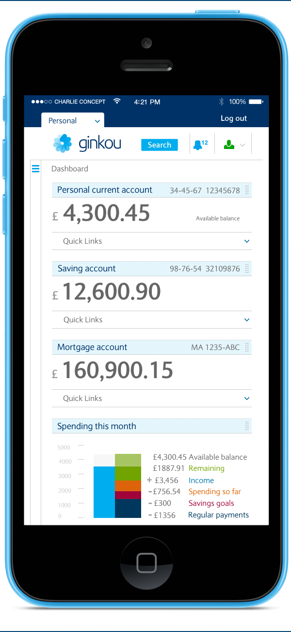
Priority is given to the clear display of the users accounts. There is also the use of a simple ‘Quick links’ drop down menu to provide the user with an easy shortcut to the most frequently used tasks associated with the account.
Integrated Personal Financial Management functionality is the heart of the Ginkou banking experience and the dashboard. Providing the user with an overview at a glance of their financial status. Everybody wants to feel in control of their money and the first step is to understand their monthly income and spending. A simple visual chart supports an aggregated financial view. This is the type of design element that really needs to be user tested and iterated, so that an easily understood interface is created.
I also think that whilst wealth and investment clients have a ‘watch list’ why don’t personal banking users have a check list of ‘Action items’. Personalised, relevant reminders, nudges and prompts that help the user take control of their finances. With budgeting and goals users are motivated to successfully plan and control their finances, and with ‘Action items’ the bank can help them to achieve their goals. Maybe one day the user will find it fun to check their balance and goals and plan their finances. Engaging light hearted calls to action might help. The bank is trying to design the best financial outcomes with their users, and a simple checklist is the start of that supportive collaboration.
It should be easy for the user to set up savings goals and budgets. I think of the two experiences as very similar and linked, with a collection of goals the user will be budgeting their finances. But by setting budgets/ limits on some categories of spending the user can put the spare money towards their goals. I think if the user can have ‘priority’ goals and see how close they are achieving them on their dashboard this may motivate them.
This is just a concept design that I quickly created but I think it tries to illustrate some of the key elements that would help create an engaging responsive dashboard for a personal banking user.