Energized Work were hired by EY to help develop and improve their existing Mobility service. Create a flexible mobility platform, which would allow companies to easily move their people to different international locations, keep up with countries regulations and laws, and create accurate reporting and oversight for the parent company.
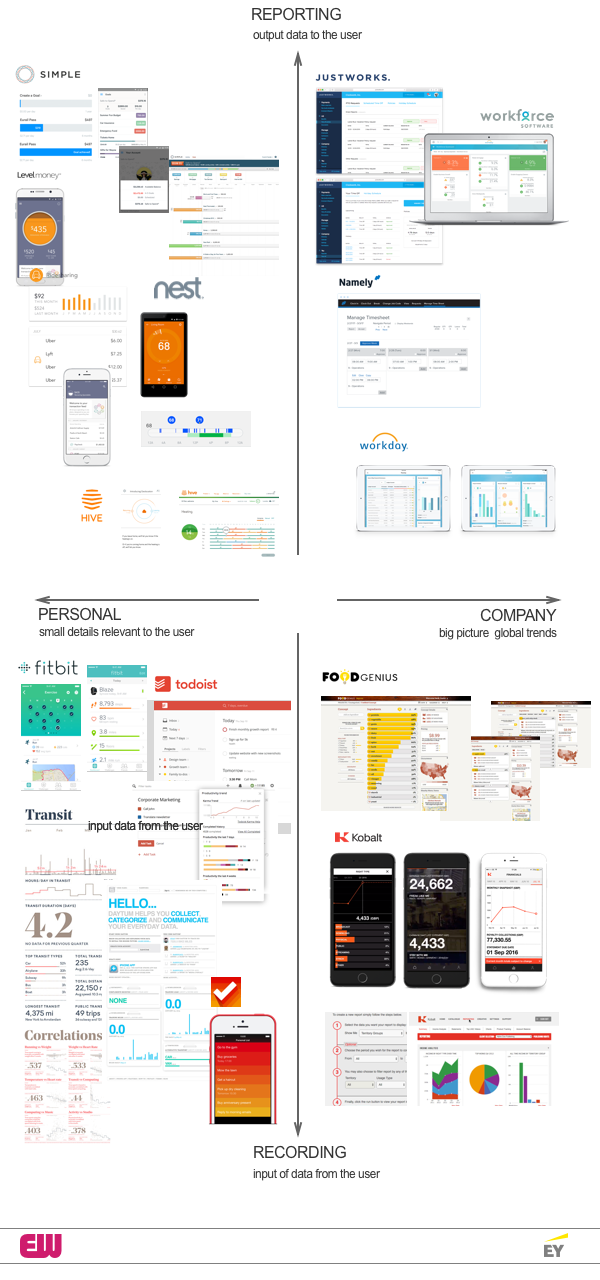
When we started looking at the EY immigration product, a lot of work had been done by Seren about the users needs, mapping the users journey, and they had created some initial designs. But I wanted to look into a wider variety of interface metaphors, so I created a quad chart to analyse some of them. I wanted to do a bit of analysis and look beyond the existing tools in the market place, to see if there were any interesting interface metaphors and designs out there. This is very much to set a vision so that people can see where they could go with the product. I divided the chart into sections that I felt captured the different aspects of data reporting, collecting and display.
Feedback that alters the users behaviour
In FinTech there has been a massive growth in apps that allow you to track and monitor your personal finances with the aim of creating savings goals or better budgeting. Simple banking allows the user to assess their total balance, see scheduled bills, set Goals and calculate a ‘Safe-to-Spend’ limit. Level money, lets the user create custom trackers for any of their habits to see how much they are spending month-over-month or totals for the year.
With domestic monitoring devices, Hive and Nest aim is to allow the user the understand and improve their energy efficiency. Nest has a green and blue thermometer interface, which displays Energy history and time of savings, which has a green bar underneath with a the blue cooling or orange heating bars shows times of the day when electricity costs were higher than normal. The darker, more intense the green, the higher the costs were during that time. You can quickly compare when your system was running and when electricity was more expensive. You could easily imagine a travel across a workforce being aggregated and displayed this way, with a cost and immigration risk markers bellow.
Trends Analysis change in data over time
With corporate HR tools, Justworks, Workforce, Workaday, and Namely aimed at small medium enterprises, showing how aggregated data can provide useful insight for the companies management team. For example Workforce Scorecard offers an easy-to-understand overview of your organisation’s health by displaying trends, and targets, so managers can make better decisions.
Big picture global trends
Two very different companies focused on the reporting side of data. Kobalt who have shaken up the reporting of royalties in the music industry, and a FoodGenius which is hoping to change how foodservice manufacturers, operators, and distributors understand their data. I have always like Kobalt since I read about the company, in Wired May 2015. Willard Ahdritz, their founder and CEO has the mantra “accountability and transparency” for the music royalties business. ( Kobalt changed the rules of the music industry using data – and saved it)
Small details relevant to the user
Fitbit, through a Wearables device make real time recording of data possible. Mobile technology means firstly inputing data on the go is easy. Secondly receiving alerts and reminders is simple. But ease of use requires the data to be automatically collected by the mobile device rather than manually inputed. I also like (everybody does) Nicholas Felton’s Annual Reports in which he produces a yearly tabulations of his life, and his related web app Daytum. In terms of providing feedback products such as the todolist and clear allow the user to understand their priorities easily through colour coding and visual weighting of the tasks. These are personal reporting and feedback interfaces that seem to lend themselves to mobile devices. It seems important that reporting back to a user about their own data should occur on their personal device. But at the next level up, where you are a manger looking at teams and trends across a business, you would want to a bigger view that a desktop allows.
In the end Energized Work only got as far as creating a simple form based questionnaire and weren’t able to explore some of the further opportunities of a mobility platform.