Both my daughters have been very lucky to go to St Judes Primary School which is just one street away from my house. When the school announced they were looking to redesign their school logo, I think we all felt I should offer to help.
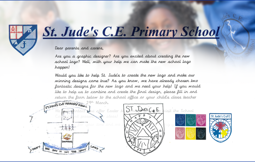
The existing logo that I thought of for the school was a stick figure, in the style of the Saint (an ITV television crime series from the sixties were a similar figure used in the title sequence). It was on the front of all the pupils sweatshirts. I hadn’t really registered the heraldic shield version, which was used on the school letterhead, and felt more official. Maybe the stick figure was more of a mascot.
An internal school competition was held for the pupils to design a logo and was declared a draw between Natalie’s and Eliza’s designs. Visually they were very different, which I felt was going to make combining them very difficult.
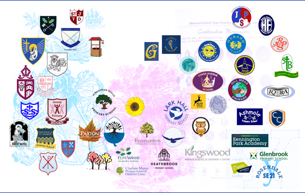
I was told that I would be pitching my ideas to the school council. So I thought I ought to take it pretty seriously. I wanted them to be able to understand what the other Primary schools in Lambeth were doing. So I carried out a bit of competitor analysis. Firstly were a lot of shields which are traditional and imply protection. Next tree and nature imagery which I felt covered growth, shelter, and with birds a sense of flight and freedom. Then there were badges that contained a wide range of symbols and monograms. Surprisingly there were very few logotypes.
I felt the pupils designs fell between the shield and badges, but their symbols and imagery was unique. Both had expressed community with figures. Eliza using three linked figures, whilst Natalie had placed linked stick figures within the outline of a cross.
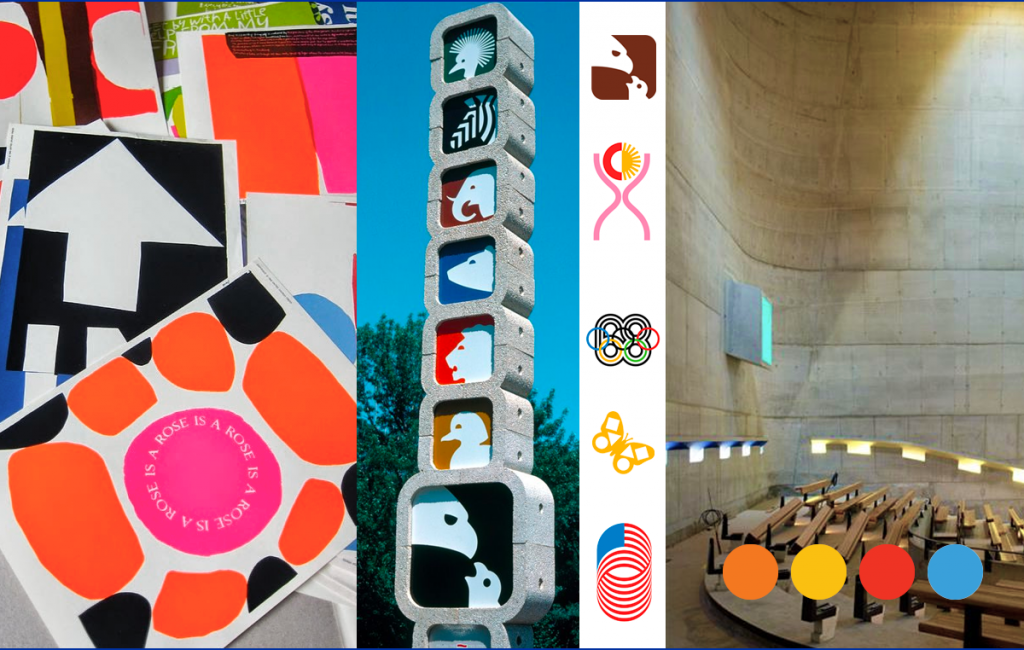
I wanted to introduce a range of bright colours. Primary schools should lend themselves to primary colours. Having grown up visiting dusty cold Church of England churches I have always felt bit a shame that we don’t recognise that medieval cathedrals would have been awash with colour. I wanted to show the school council the work of Sister Corita Kent’s and her colourful screen prints. She took the aesthetics of pop art, mixed in the logos of corporate America to create civil rights posters that campaigned for social injustice. They of course had a strong Christian message as well. With Lance Wyman’s work I wanted to explain how great logo designs work at any scale and how you could play with positive and negative forms. I’m not sure if I got round to churches and stained glass windows, but even modernists like Corbusier seem unable to resist the positive effect of bright colour.
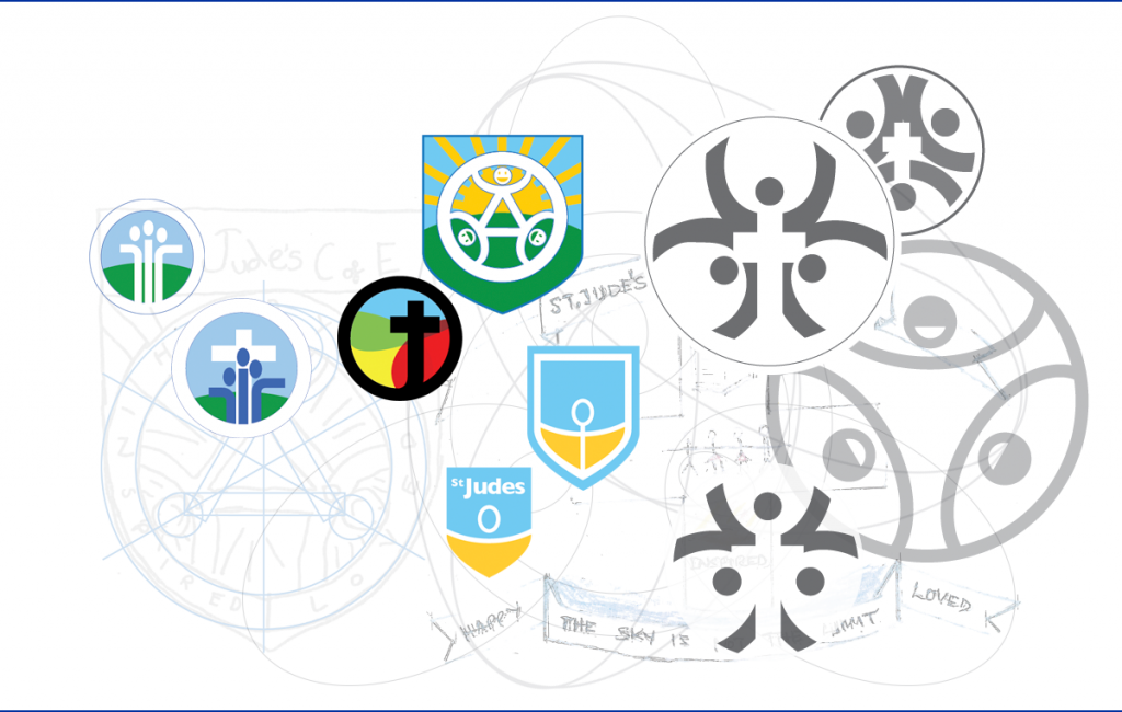
I was keen to present options to the school council. So had sketched out a whole range of ideas. I had rather nervously tried to combine the three figures of Eliza’s design with the central cross of Natalie’s design.
Anyway one evening after school I was invited along to pitch my ideas to the school council. So I mocked up some of the above as A3 mood boards and nervously waited my turn in the school art room. Expecting a scowling local vicar, some official from the council and a spread of the parents committee who I’d probably upset in the playground by refusing to man a stall in the summer fair.
I was led to the art room and was very relieved to discover that the school council was made up from two pupils from each year. Who knew? Anyway we had a laugh and narrowed down the ideas, and I came away with a clear direction from them. Shields were out, circular badges were in. Being together and community was really important, and they were all for a simple modern look and feel.
Miss New the schools head teacher told me that the council had thought my ideas the best and that we should get going on finalising the design.
After a few attempts the design below was settled on. The school was updating all its uniforms so we had to liaise with the uniform manufactures to see how well it would actually work when it was embroidered onto the uniform. I think the smallest it goes is onto the front of the white school polo shirts.
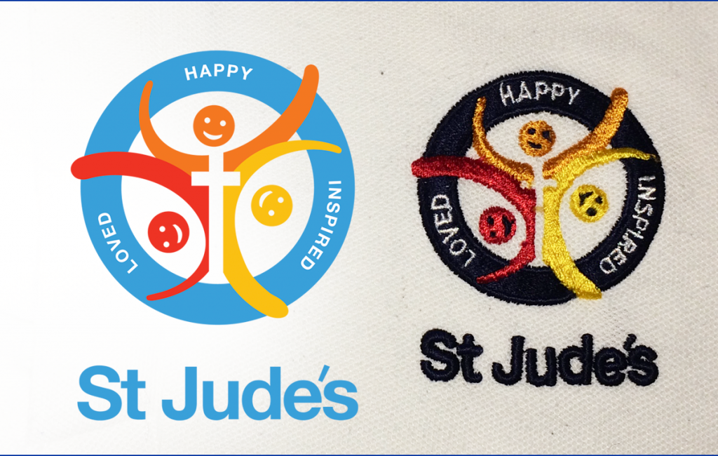
I hope it is an honest hybrid of Eliza’s and Natalie’s designs. I’m not sure I could have found a simpler form without it loosing all meaning. For me its fun to go to school pick up or drop off and see all the children running around with the logo design I helped make on their uniforms. You can also see a few more examples on St Jude’s school website.