Energized Work was asked by Ernst & Young Global Limited to upgrade their mobility offering for their corporate clients. A corporation would buy EY’s mobility services and expect EY to be able to manage their travelling staff’s tax, immigration, and travel risk. Large corporations need to move their employees around the world, and EY offers a number of services to manage all the different business immigration rules and tax implications of their staff when they go to work in different countries.
EY needed to upgrade their software, as it was difficult to maintain and complex to use. It was hard for internal staff to manage, and also was a clumsy user experience for the business traveller when they had to manage their journey details. In fact when we interviewed most users, if they were senior enough they made their reports fill out the travel details for them, or they left it all until the year end and spent two days filling in the details for a whole year. Neither options really made for an accurate gathering of data, or confidence that the business traveller was actually compliant with their travel obligations.
The compliance process could be very laborious and manual as a lot of business travellers would end up visiting multiple countries in a single trip. Complex trips usually required the business traveller assessing their journey with an actual EY mobility adviser. EY has a network of some 10,000 global people advisory services professionals across 180 countries, so any slight improvements in the initial assessment could have a massive impact on this team, saving both time and costs for everybody. I don’t think the process could ever be fully automated as the vagaries of local laws and regulations meant that assessing complex risks would always be a matter of opinion based on the EY advisers expertise. Having interviewed a few of the mobility advisers as part of our research we quickly discovered lots of small changes to the process would really improve the user experience, but it was never going to fully replace the advisers.
Energised work had a proven track record of delivering complex systems that worked from the get go. We would focus on the building a Sales prototype, and improving the front end presentation layer. So EY would be able to test their new product with their corporate clients and internally with their own business travellers.
Elegant forms
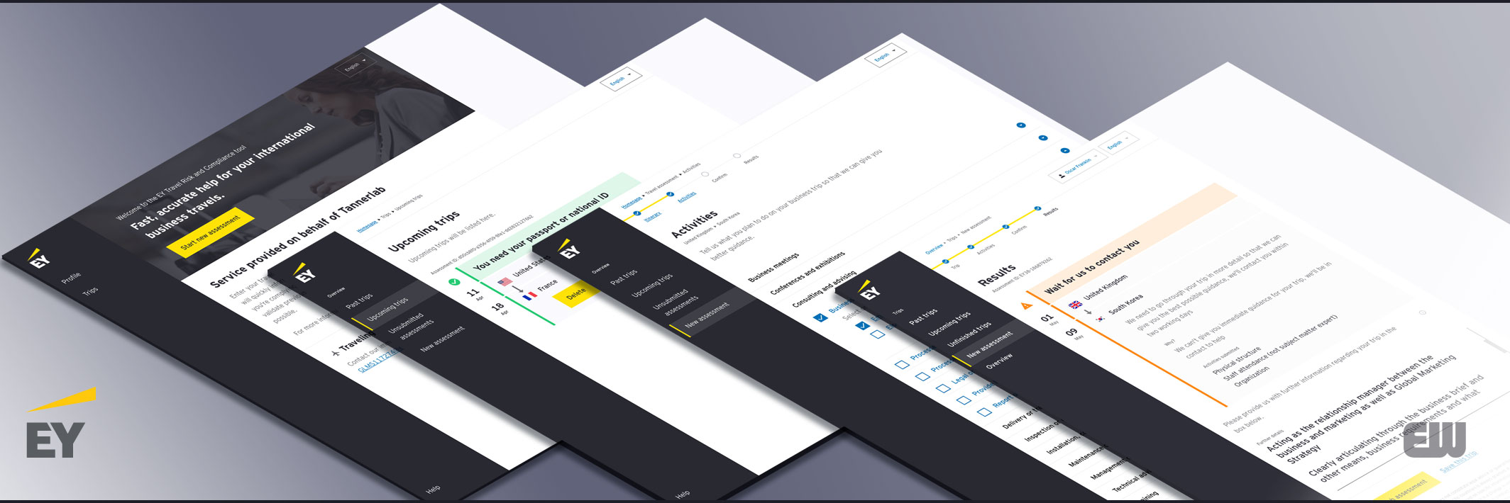
Having conducted a series of initial workshops with key stakeholder, we broke down the proposition into a number of key stories. It was obviously going to be a form based questionnaire which would query a back end that was able to interpret all the rules, regulations and laws around business travel. We spent a lot of time working with senior stakeholders trying to understand these rules and regulations.
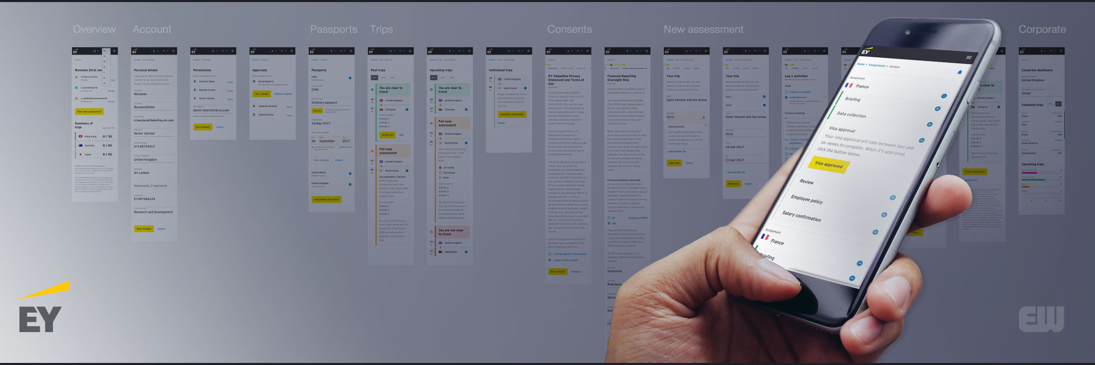
The front end presentation layer was a classic UX task of building a clean and simple user interface around a multi-step input form process. I had happened across ‘bitter renter nyc‘ which I felt was a very elegant form based approach to working out if you could afford to rent in New York. I was very taken with the fact that the navigation also was each step in your assessment, and that there was relevant help at every stage. I shared this with the team so that we could use some of these ideas in our designs.
The presentation layer involved balancing and managing input from EY’s brand and marketing team, a brand agency, Nalla who provided their own designer Jon Atkins, myself and Emmett from Energized work, and prior research by Seren whom EY had just purchased.
Despite the complexity of immigration rules and regulations the designs had to allow the business traveller to step through a series of simple forms. We wanted the users to be able to quickly understand their options, and each step guide the user to successfully complete the questionnaire.
We stuck to a one column layout for the forms, letting the user simply move down the page in a straight line, and we also broke each stage into a series of tasks, so they could see that they were making progress through each step.
Modular design
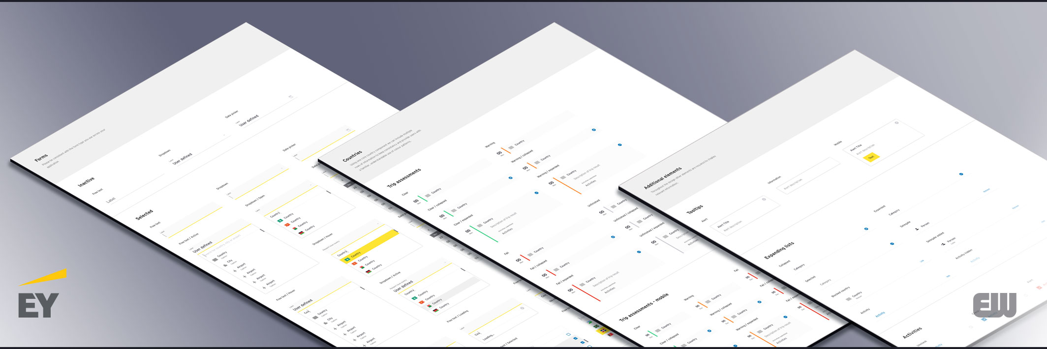
Energized work had pitched to EY that we were really building them a platform on which to develop adaptable, resilient, digital product. As part of this the UI and UX components needed to be re-usable. So the design approach was modular. Each design could be broken down into small parts (modules), so we could create them independently, and they could always be combined back into a larger system. We were also using the ember.js framework which leant itself to this modular approach.
For example we were able to rapidly develop the back end product management tool re-using front end components. So the modular approach created a system that was flexible, easy to scale, and still have a consistent design.
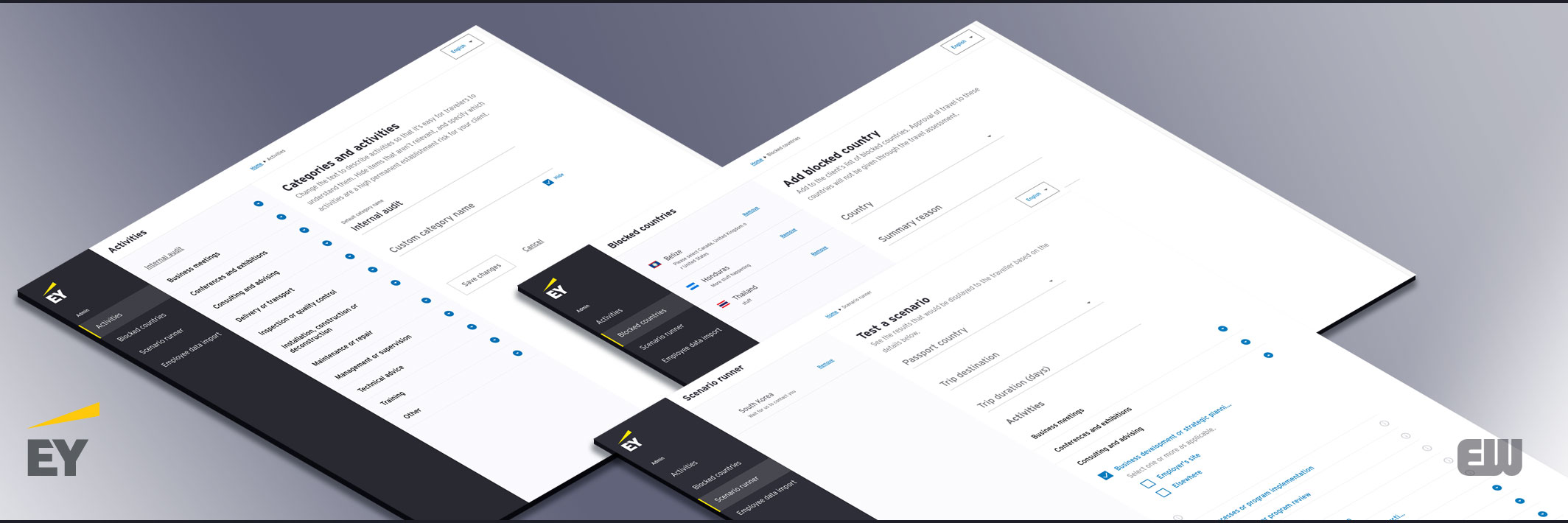
Taking a modular approach also made it easy to document our components. So that others EY teams could build on our platform we started a basic Design System so that the components could be easily referenced and re-used.
We quickly developed a responsive mobile first sales prototype, that could be used to test new ideas with potential customers and gather feedback from existing customers.
We built the beginnings of a mobility platform for EY.
- Open. A set of well defined interoperating systems that provided services and information to both the customers, business travellers, and the internal users, mobility advisers.
- Robust. Systems are not just software, but the services that support their operation. So we designed a robust product that could absorb variations and requests for change whilst still maintaining and improving the EY mobility service.
- Simple. We worked hard to understand the context before introducing new technology. If you must build a system build a small one, and don’t introduce new systems and processes if you don’t need them.