time to go
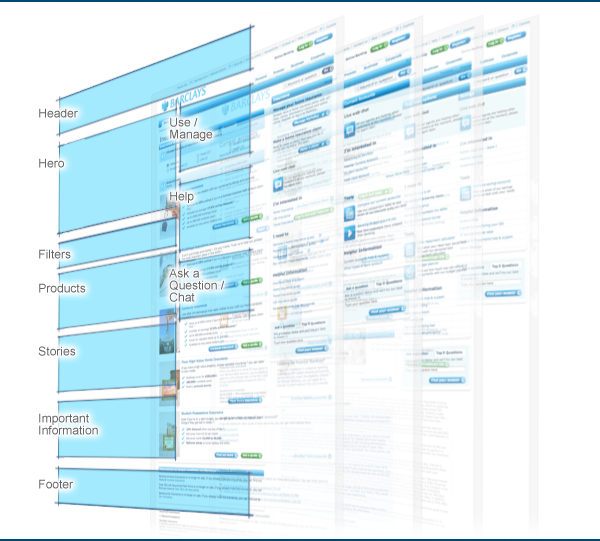
Large corporate website are constantly changing. New products to promote, and new commercial goals. The users needs change from desktop to mobile, from mouse to touchscreen, from static to dynamic. An existing web site can begin to look tired, staid and incoherent. Over time each area of the site has created a solution unique to their needs, and so has moved away from the simple templated site of the original. It begins to feel as if design and the user experience is becoming arbitrary. Every one starts getting nervous and asking for a redesign.
Continue reading Evolving the user experience of a corporate website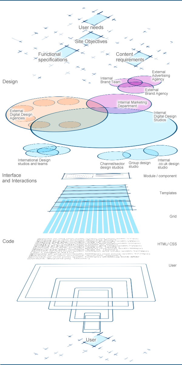
With a corporate bank there are many conflicting sources of design and creative direction. So having gathered the users needs, understood the sites objectives, discussed the functional specifications and content requirements the project has to navigate through the corporations design culture. This culture is always changing, like a river.
Continue reading Code is poetry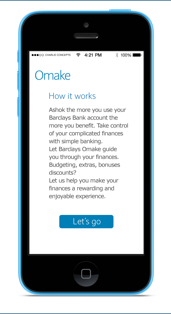
This is a concept idea for making banking more engaging. I am using the idea of a points rewards system to reflect the users engagement with Barclays products and services. It may be possible to then associate these omake with a financial reward. Omake is japanese for extra, bonus, discount and I am using it as a metaphor instead of the usual wallet metaphor which is always associated with digital payments. A wallet places the emphasis on the storage of rewards, just abstractly visualising the rewards focuses the user on the benefits. It is an experiment with a game like display that may make the user more engaged? I have chosen a simple metaphor of filling a board/grid with coloured squares representing the rewards (omake) the user has earned and achieved. I hope this makes it clear to the user that the bank is recognising their achievements by rewarding the user when they have accomplished something. It has to be integrated with all the bank site, rather than trying to build a hub that the user is pointed to.
Continue reading Barclays Omake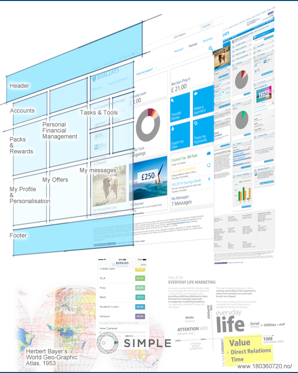
I wish I had run more workshops at Barclays, as its a great way to get inside the teams head, and where their thinking is. These are my notes from a workshop I ran in January 2014. It is also just to enjoy ‘thinking work’. Denkarbeit. The team spend so much time creating material I wonder when they have time just to think broadly about banking as an experience.
Continue reading Denkarbeit
I was asked to explain UX to another team in the online banking department. The department had a fancy dress day for Halloween. So I made a little website to describe a few aspects of the discipline of UX with a Pumpkin of Truth theme. A bit like a magic eight ball, but a pumpkin. Embarrassingly I also spent the whole day wearing a blue homemade papier mache pumpkin on my head.
Continue reading UX Pumpkin of Truth
Well where to begin. There appears to be a lot of these being worked on at the moment, and whilst they flex and change to meet each individual projects requirements do we really have a handle on what fundamentally makes a good customer journey map.
Continue reading ABC Design Customer Journey Maps
Thinking about info graphics, one of my criticisms has been that we don’t spend enough time thinking about the organisation of the information in our finished design. We tend to place it all down in one go. This often leads to congested designs that aren’t easy to scan or navigate. I came across this graphic which I quite like, but I think its doing a few things really well.

The Vodafone M2M portal created one access point for the entire life cycle of their M2M SIMs. From supply, through instillation to status monitoring during usage. Vodafone have changed their approach to developing the M2M Portal so that it is now centred on user needs rather than on functional requirements. We helped the Business Products Team to drive this new user centred design approach. The ambition has been to build on existing interactions and functionality from current products such as GDSP and Service Navigator, and also design new experiences specically for M2M.
An 8 week discovery phase used a rapid, iterative design process focussed around over 200 use cases and user stories.
Ran detailed workshops with key stakeholders from all of the Vodafone teams, including Group Technology, Service and Support, Programme, and Business Products Marketing.
Iterated design solutions for the key areas of the M2M Portal, SIM Management, User Access Management, Billing/Invoicing, Reporting, Ticketing, and Trial.
Created visual design templates which capture the full look and feel of the site.
These example screens have been selected from the 111 wireframes and show a detailed level of visual design.
These are my notes on design strategy in order to clear my head of them. They are not a coherent argument, they are ideas and concepts arranged in a long list.
