Category Archives: Working

Case studies and examples of my professional work

EY Travel assessment

Mobile screen view of the EY Travel assessment tool

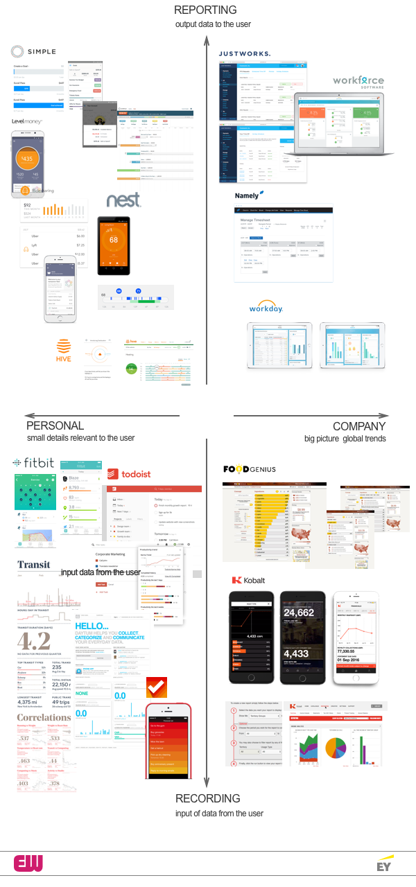
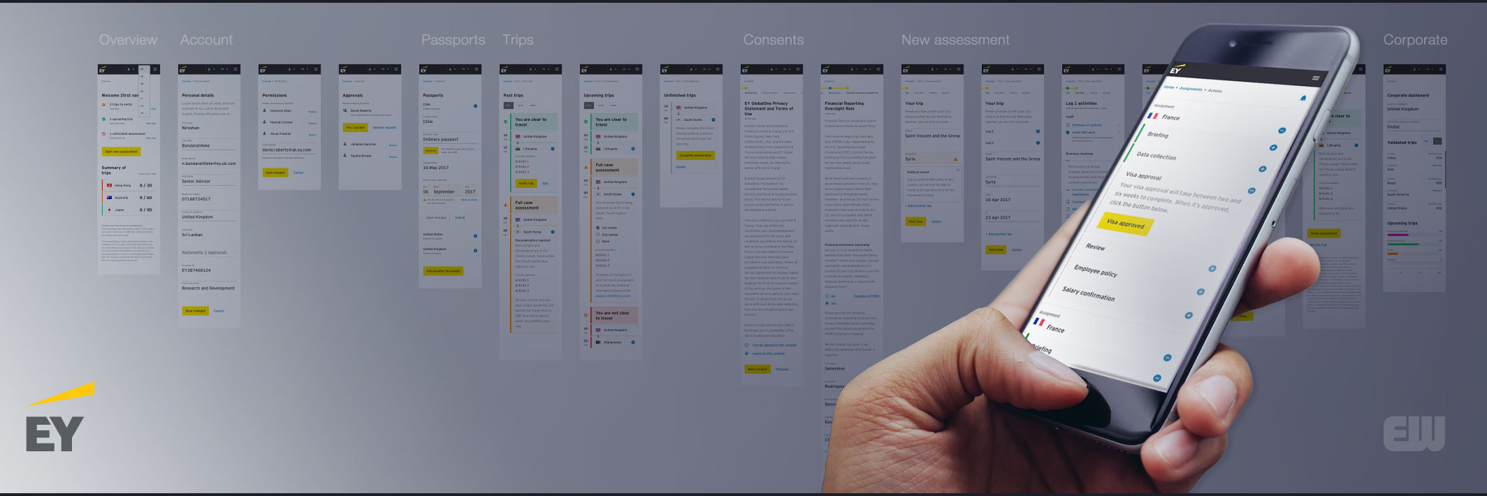
Energized Work was asked by Ernst & Young Global Limited to upgrade their mobility offering for their corporate clients. A corporation would buy EY’s mobility services and expect EY to be able to manage their travelling staff’s tax, immigration, and travel risk. Large corporations need to move their employees around the world, and EY offers a number of services to manage all the different business immigration rules and tax implications of their staff when they go to work in different countries. 

Continue reading EY Travel assessment

Different interfaces for displaying corporate and personal data

Designs of Dashboard design and web applications for displaying data arranged in a quad chart

Energized Work were hired by EY to help  develop and improve their existing Mobility service. Create a flexible mobility platform, which would allow companies to easily move their people to different international locations, keep up with countries regulations and laws, and create accurate reporting and oversight for the parent company.

Continue reading Different interfaces for displaying corporate and personal data

Service Design at Pottermore

Customer journey maps and persona chart for Pottermore

Pottermore had an established set of personas for their users, the challenge was to bring them to life for the management team.  The easiest way was to combine personas with actual customer data, so we could work out where the pain points where for various tasks the users wanted to complete. At the time I was reading, ‘Badass: Making Users Awesome’ by Kathy Sierra, so was trying to see how you could make it easier for casual users to become more engaged and become ‘evangalists’ or ‘story masters’.

Continue reading Service Design at Pottermore

Do-it-yourself usability testing

Harry Potter picture merged with Don't make me think book cover

I wanted to improve the Pottermore website, in terms of its usability. With a very crowded publishing schedule, there was always something new to publish or promote, so there wasn’t a regular testing process. I asked some neighbours and friends if they would participate in some informal testing.

I based my test around Steve Krug’s book, ‘Don’t Make Me Think: A Common Sense Approach to Web Usability’, which is pretty much all you need to know about user testing. He advocates that even informal do it yourself testing is better than no testing at all.

Continue reading Do-it-yourself usability testing

Experiments in Pottermore chronology and taxonomy

When I was lucky enough to be working at Pottermore, there was a whole bunch of ‘fact checkers’ who knew the Harry Potter universe inside out, and when EW originally pitched to Pottermore Gus proposed and prototyped a ‘narrative engine’ for exploring the story.

As a personal side project I thought it would be great to try and understand the time over which the Pottermore universe unfolds and see if there were any interface metaphors or concepts that could be used to make the content of the site more discoverable.

Continue reading Experiments in Pottermore chronology and taxonomy

Ideal Mix – thoughts on the UX design process

Retro Book cover featuring David Byrne of Talking Heads

Introduction

The explosion of management theory in the 1990’s as pointed out in ‘One market under God’ by Thomas Frank, has created a situation where every one has a better theory than the previous person. This makes me nervous about writing a few posts about UX processes. So I don’t want them to be too theoretical but practical. I also want to credit lots of people along the way, because there are so many clever people out there who have already solved these problems. But I think as a manager you are always looking to find a better way of working. I think as new software becomes available you can practically solves some of the old recurring problems.

Continue reading Ideal Mix – thoughts on the UX design process

Building Barclays UX team

Lead UX Researcher presents the UX lab to the team

I was asked to turn around the UX team by Jo Brown (Director of Propositions and Development, Digital Banking) who asked me to move from Seren to join her at Barclays. It was the beginning of two or so years of very hard work, I wanted to build a confident team culture that allowed my team to have purpose and enjoy designing in the very demanding and ambitious environment of Barclays Bank.

Continue reading Building Barclays UX team

Responsive banking dashboard concept

Ginkou-mobile-dashboard_001

The user’s dashboard should be an honest, fun, collaborative, conversational, engaging interface that lets the user control their money in the Ginkou bank. So that they feel that they have control of their finances. The bank is supporting them in achieving their goals in life with simple financial management. The dashboard represents a move away from reporting financial data to the user and towards engaging with them in designing the best financial outcomes for them.

Continue reading Responsive banking dashboard concept